U+10ACF MANICHAEAN LETTER YODH has two shapes: curl and dot #8
Comments
|
Fixed in #9! |
|
This is not fixed. This bug report is about the inconsistency of standalone yodh with ligated yodh. The new glyphs are still inconsistent with each other. The reason they should be consistent with each other is that this ligature is supposed to be just a minor (and optional; see #2) modification of two adjacent shapes to fit better together (like Latin “fi”) rather than a new shape (like Arabic “لا”). The new glyph for yodh is a curl with a ball terminal. However, in Manichaean, yodh has two variants (dot and curl) but I have not seen this combined variant of dotted curl. To be clear, the dot is not supposed to be a terminal: it is the entire letter. I’m calling it a dot but it isn’t necessarily always literally round. It is about the size of other small letters, like U+10AC7 MANICHAEAN LETTER WAW, not as small as U+10AF4 MANICHAEAN PUNCTUATION DOT. |
|
@PaulHanslow FYI |
|
Cheers. Will update shortly or early next week. |
|
@dscorbett, I'll do my best to correct the issue. Sometimes pictures (even if they're rough) go a long way in helping to understand the issue. Text base descriptions have their place yet how the mind's eye visually interprets descriptions can vary vastly. |
|
There are links to scans of manuscripts in the first comments of this issue and #2. |
|
@dscorbett Thank you for the links to the manuscript examples. After a few tests, disconnecting the yodh (U+10ACF) dot and having the sadh (u10ADD) hook around to the yodh looked odd. I believe the best solution is to alter the original yodh + sadh (u10ADD_10ACF) ligature to have a bigger yodh 'dot' which remains slightly connected to the 'dot'. This will make it more obvious that the dot is a letter and not a balled terminal for the sadh. See image.
|

|
That might be a good idea too, but it won’t fix this issue. The problem is that the ligated yodh (a dot) looks completely different from the unligated yodh (a curl). |
|
@dscorbett, before moving forward with any fixes, I'm writing a detailed analysis to ensure the work is completed correctly. As I'm a type designer, visual examples go a long way to helping me visualise/fix issues. My solution is: Move curled yodh and current ligated forms to stylistic set (ie. SS01)The 4 characters shown below would be retained and moved to SS01, so users can activate the curled yodh if desired. My reasoning is the curled yodh is still in use in manuscript examples. The current curled yodh (U+10ACF), and yodh + sadh (u10ADD10ACF). My reason for this is because the curled yodh is still in use in manuscript examples: I have two design suggestions to hamonise the designs of the yodh and the ligatures:
I'd ideally like the characters moved to SS01 to hamonise visually but dont know the best approach. Please advise. Redesign yodh to be dotted and roll this into the ligatured isolated and final formsThe new default forms will be as sketched below. Please note these are rough sketches and their proportions will be fixed in the final work: These forms would now be the default forms, with the yodh being a dot. The ligated yodh_sadhe will also be changed to use the dotted yodh form, albeit disconnected from the sadh's swoop, which wraps around the yodh dot. CONCERNS/QUESTIONS: I assume the yodh final (u10ACF.fina) still connects to the previous character (i.e. it would now be a dot that has a connecting strong on the right side)? I believe so but cannot verify this from looking at manuscripts. Please let me know. |


|
The redesigned glyphs look basically correct and form a coherent set. However (maybe this is what you meant about proportions but I want to make it explicit), the dot as sketched is too small: the glyph in the manuscripts is generally the same height as other letters. “Dot” might have been a misleading word on my part: it is more of a disk or a blob. See the images linked in #2 for many examples. If the current ligature glyphs are kept in some form, they should be modified so that their yodh parts are as big as the new standalone yodh glyphs, similar to your previous comment but maybe a bit bigger. In #2, I could not find any examples of a fully cursively connected sadhe–yodh ligature like the font currently has. At most, the edges of the two letters just barely overlapped. Therefore, it might be appropriate to delete the current ligature glyphs entirely. However, it’s possible that the ligatures are attested in other corpora that I didn’t check. Moving all four current glyphs into 'ss01' is certainly better than the status quo, but it is still suboptimal. The issue is that those four glyphs do not form a coherent set: two have curled yodhs and two have dot yodhs. It would never be realistic to enable that stylistic set for a document. It could make sense to put the curled yodhs in 'ss01' and the ligatures in 'ss02' (or vice versa). It could also make sense to delete some or all of them. If the curled yodh glyphs are kept, they should be tested to look good after sadhe, which might require two new ligature glyphs, or else just some kerning. |
|
The following characters have been updated and pushed: For comparative sake, the original shapes are displayed in the image below. These shapes have been retained and copied to new character cells within the Glyphs source. The naming new conventions for these shapes are listed below: The CURLED YODH has been renamed with the suffix '.ss01' and should be mapped to stylistic set 1. These shapes exist in manuscripts, mostly in headlines, and in my opinion are worth retaining within the sources. As @dscorbett commented, the previously designed YODH + SADHE ligatures don't stylistically match the CURLED YODH. The former have a small dot representing the YODH, which is incorrect. However, there is no examples of how the CURLED YODH should/would ligate with SADHE (this assumes there's a ligated form of CURLED YODH + SADHE). Rather that delete the old ligated forms, they've been retained, renamed with the suffix '.ss02' and should be assigned to stylistic set 2. The aim is to isolated the CURLED YODH and previously designed ligated forms into separate stylistic sets for individual activation. I'm more than happy to update the YODH + SADHE ligatures after establishing if/how the CURLED YODH ligates with SADHE. |


Excellent, thank you!
Um - I can't see them. Is there a pull request? |
Font
NotoSansManichaean-Regular.otf
Where the font came from, and when
Site: https://github.com/notofonts/manichaean/releases/tag/NotoSansManichaean-v2.005
Date: 2023-10-07
Font version
Version 2.005
Issue
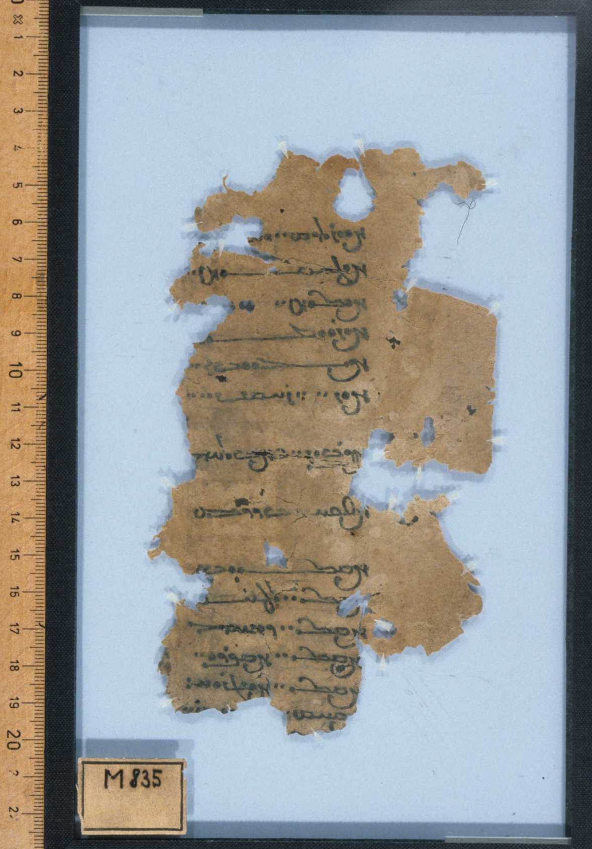
This font uses two shapes of U+10ACF MANICHAEAN LETTER YODH: a curl by default and a dot in ligatures. It should be consistent. I tentatively recommend using the dot shape because it seems much more common in body text.
M 98 and M 102, for example, use the curl shape in the heading and mostly the dot shape in the body. M 102 has three instances of the ⟨𐫝𐫏⟩ ligature: the yodh is a curl on line 1 of the body and a dot on lines 6 and 9. That shows that the choice of shape is not determined by whether there is a ligature.
The current dot in the ligature glyph is too small. It should be the height of a letter.
Character data
𐫏𐫝𐫏
U+10ACF MANICHAEAN LETTER YODH
U+10ADD MANICHAEAN LETTER SADHE
U+10ACF MANICHAEAN LETTER YODH
Screenshot
The text was updated successfully, but these errors were encountered: