Story Elements
Title – Google shows up to 70 characters (including spaces) of a page's title in its search results. The title text can be changed at a later date.
Excerpt - This is the page’s description. Google shows up to 370 characters (including spaces) of a page's description in its search results.
Related Posts (Doubled Up) - Select the student authors, order alphabetically by last name.
Featured Image – This will appear in the post's header. Images should be chosen and optimized for the header design.
Stories use WPBakery Page Builder to layout page elements.
There are two elements that act as buckets for all content in the article: Row and Section.
 Row
Row“Row“ is the main container element. Across the top of a row, tabs include:
 Drag and drop
 Column layout (DO NOT USE)
 Add an empty column below. (DO NOT USE)
 Hide Row content from view while editing.
 Edit Row settings (DO NOT USE)
 Duplicate Row and all its contents
 Delete Row and all its contents
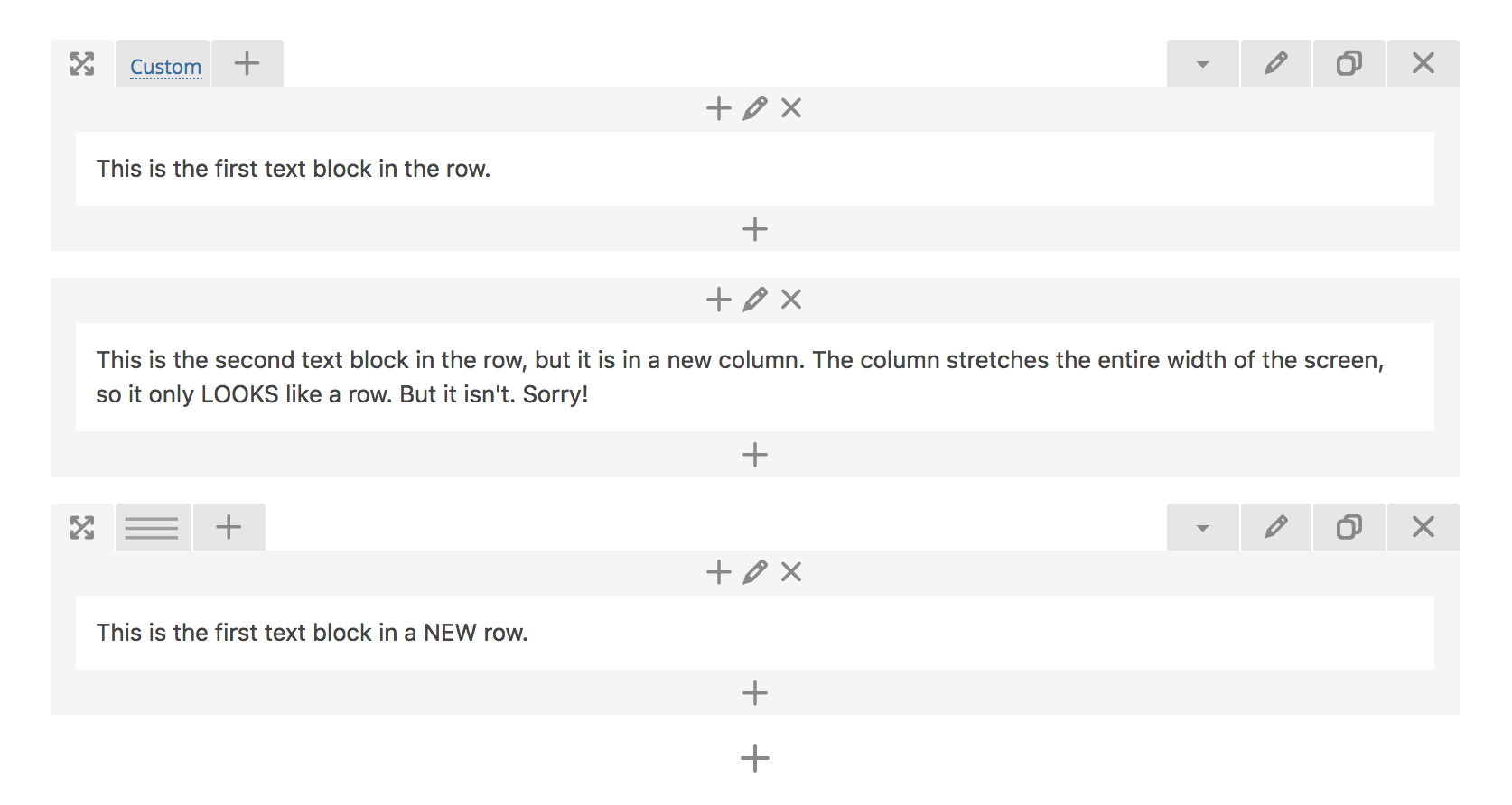
Each Row automatically includes a Column. However, because we are not using the Column functionality, every column appears to stretch the entire width of the row. Do not mistake a Column box for a Row box! Please ensure there is only ONE Column per Row.
The Column options include:
- Prepend a content element to the Column
- Edit the Column settings (DO NOT USE)
- Delete Column
 Section
“Section“ is root largest container element that allows you to ‘group’ several rows. You can insert section into root canvas only (section element can not be inserted into any other element, including row). All content in the Section element must be contained inside row elements. If add a title to a section, that name will be added to the dropdown list of links at the top of the published page (titled “Sections”), allowing the user to jump to various areas of the story easily from anywhere on the page. left row’s corner) and drag row around (vertical axis).
Drag and drop
Add an empty row inside the section.
Edit Section settings
Duplicate Section and all its contents
Delete Section and all its contents
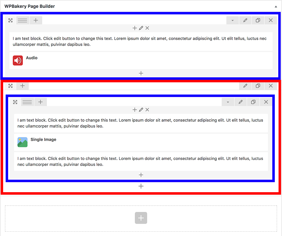
View of backend editor. Red outlines a Section, Blue outlines a row
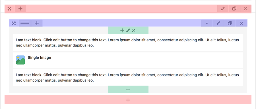
View of backend editor. Red = Section Options, Blue = Row Options, Green = Column Options
Content elements hold the text and media. To edit the content of these blocks, hover over block and options will appear:
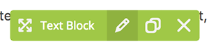 (from Left to Right: Drag and drop, Edit, Duplicate, Delete)
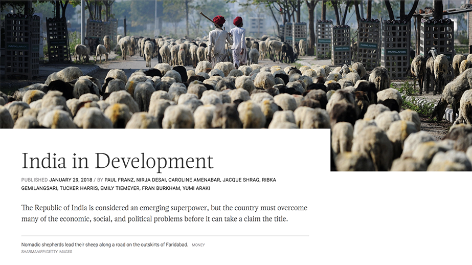
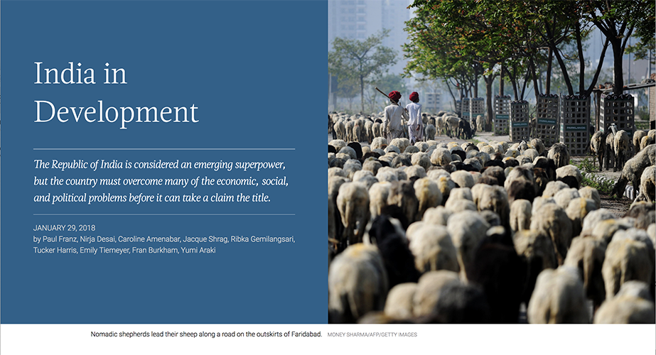
 Post Header
This is the first element block that should appear on the page. It contains the Story’s Title and metadata. Options include:
-
Intro – textfield (try to stay under 180 characters)
-
Header Style – dropdown
-
Full Width
-
Blocks
-
-
Image Vertical Position- dropdown
- Top
- Middle
- Bottom
-
Image Horizontal Position- dropdown
- Right
- Center
- Left
-
Highlight Color – Color picker
-
Include featured Image source info – checkbox
- Source Title – text, optional . A link to the audio file
-
Source URL – text, optional
. A link to the source
Note: image is pulled from the “Featured Image” section
 Text Block
A “Text block“ allows you to insert paragraph type text and format it using WYSIWYG editor. Although this block text block allows adding media(images and videos). Although you have the choice to add media to the text block: DO NOT. Add an image using the Image Block.
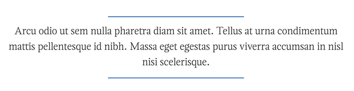
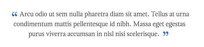
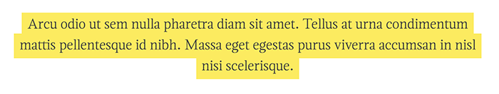
 Blockquote
These are pull-quotes from the story.
- Content – text
-
Full Width - checkbox.
NOTE: If unchecked, the quote will appear to the right of the text block directly below (make sure both elements are in the same Column). -
Blockquote Style – dropdown
. Use the same style throughout the entire story
-
Lines
-
Accent Color – color picker
-
Accent Color – color picker
-
Quotes
-
Accent Color – color picker
-
Accent Color – color picker
-
Highlight
-
Colors pairings – dropdown
- Yellow
- Black
- Gray
-
Blue
-
Colors pairings – dropdown
-
Lines
 Character Detail
The Character Detail highlights important personalities. This block appears to the right of the text block directly below (make sure both elements are in the same Column).
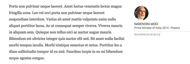
- Name – text
- Description – text
-
Image – choose from Wordpress media library, upload your own.
NOTE: Make sure the image is square. You can crop an image by editing it on Wordpress. -
Include featured Image source info – checkbox
- Source Title – text, optional . A link to the audio file
- Source URL – text, optional . A link to the source
 Transcript
This element allows you to highlight content such as interviews or transcripts.
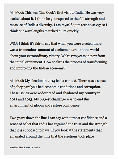
-
Content – WYSIWYG editor
NOTE: Please make sure to use the format of[Name]:[Content] - Source Title – text, optional A link to the audio file
-
Include featured Image source info – checkbox
- Source Title – text, optional . A link to the audio file
- Source URL – text, optional . A link to the source
 Single Image
A single image displays an image. The captions are automatically pulled from the images’ meta information.
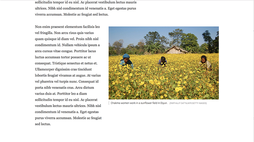
-
Full Width - checkbox
NOTE: If unchecked, the image will appear to the right of the text block directly below (make sure both elements are in the same Column). -
Image – choose from Wordpress Media library, upload your own
NOTE: The caption will be taken from the caption you write when you upload the image to the Media library -
Include featured Image source info – checkbox
- Source Title – text, optional . A link to the audio file
- Source URL – text, optional . A link to the source
 Image Group
The Image Group displays two related images side by side. The captions are automatically pulled from the images’ meta information.
- Full Width - checkbox NOTE: If unchecked, the images will appear to the right of the text block directly below (make sure both elements are in the same Column).
-
Image – choose from Wordpress Media library, upload your own
. Choose 2 images.
NOTE: The caption will be taken from the caption you write when you upload the image to the Media library.
 Text Over Image
This elements allows you to break up the story a little bit by changing the entire reading experience. Text is placed over a large image. Make sure the image is at least 2,000 pixels wide and 1,000 pixels high
- Content – WYSIWYG editor
- Image - choose from Wordpress Media library, upload your own
- Background Color– color picker
-
Photo credit has white text – checkbox
NOTE: the color will depend on the background image and if it’s easier to read the caption if the text is white -
Include featured Image source info – checkbox
- Source Title – text, optional . A link to the audio file
- Source URL – text, optional . A link to the source
 Video Player
An element to hold video.
- Video title (“Widget title”) – text
- Video link – text
- Video caption – text
-
Include featured Image source info – checkbox
- Source Title – text, optional . A link to the audio file
- Source URL – text, optional . A link to the source
An element to hold audio clips. This block appears to the right of the text block directly below (make sure both elements are in the same Column).
- Title – text
- Description – text
- Url – text; A link to the audio file.
- Highlight Color – color picker
-
Include featured Image source info – checkbox
- Source Title – text, optional . A link to the audio file
- Source URL – text, optional . A link to the source
 Raw HTML
The iLab will inject code to show data visualizations.
- HTML – text
-
Full Width - checkbox.
NOTE: If checked, the content will take up the entire width of the window. If unchecked, the content will appear as wide as the paragraphs.
 Empty Space
Inject some extra space, just in case.
- Height in pixels