Skip to content

MenuItem decomposition - usages with avatars - #98862

Draft
war-in wants to merge 10 commits into
Expensify:mainfrom
software-mansion-labs:war-in/menu-item-decomposition-entity
Draft

MenuItem decomposition - usages with avatars#98862
war-in wants to merge 10 commits into
Expensify:mainfrom
software-mansion-labs:war-in/menu-item-decomposition-entity

Conversation

@war-in

@war-in war-in commented Aug 18, 2026

Copy link
Copy Markdown
Contributor

Explanation of Change

Part 2 of the MenuItem decomposition — the avatar-led rows. Adds the Leading and Label primitives, a typography variant on Description, testID on Root and the presets, and a MenuItemEntity preset, then migrates the avatar call sites.

Two notes for reviewers:

  • MenuItemEntity is deliberately narrow — a UserAvatar plus an always-on chevron. Rows needing a workspace avatar, an ID-driven ReportActionAvatars, or no chevron drop to raw composition rather than growing the preset.
  • MenuItem.Description gained a variant. placeholder reproduces the legacy font bump that happened automatically when a row had no title, so title-less rows keep rendering at the standalone size.

Fixed Issues

$ #96202
PROPOSAL:

Tests

  1. Run npm run storybook and open the Components/MenuItemComparison story
  2. Verify that in every card of the Phase 2 — avatars section, the Legacy, Composable and Preset renders are identical
  3. Verify that the Phase 1 — icon rows cards below are still identical

Migrated rows, checked against main side by side:

  1. Open Settings > Security > Add copilot, pick a member and continue, and verify the confirmation row shows their avatar, name and login
  2. Open Settings > Profile > Status and verify each delegator row shows an avatar, display name and login, spaced evenly
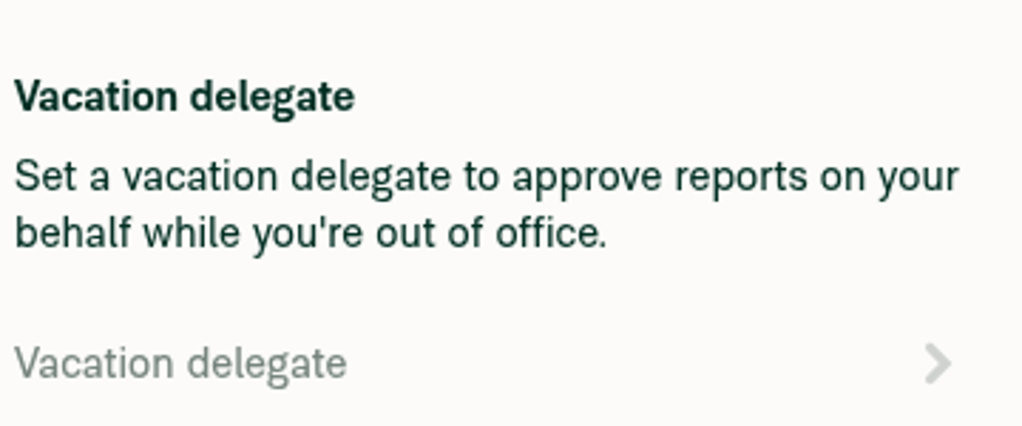
  3. Open Settings > Security, set a vacation delegate, and verify the row shows the delegate's avatar, name and login; clear it and verify the empty row shows Vacation delegate at the larger standalone font size
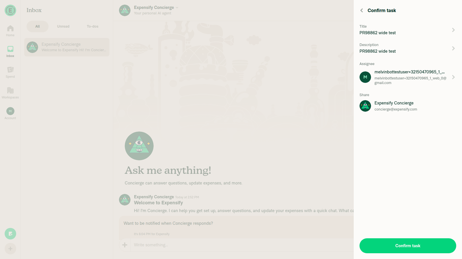
  4. Start a new task from the global create menu and verify the Assignee and Share rows show avatars, labels, tooltips on hover, the Required hint while Share is empty, and the chevron
  5. Open a workspace > Members > a member and verify the Profile row still navigates and is spaced from the section below
  6. Open Settings > Security > multifactor authentication revoke page and verify each device row shows its title with a working Revoke button on the right
  7. Send an invoice from the global create menu and verify the Send from field shows the workspace avatar, name and Workspace, and only shows a chevron when the sender can be changed

Offline tests

Mostly N/A — a component refactor with no API or Onyx changes. One row keeps offline feedback:

  1. Go offline
  2. Open Settings > Security and set a vacation delegate
  3. Verify the delegate row greys out with the pending style, and that the error row and its dismiss action still appear below it when the request fails

QA Steps

N/A

PR Author Checklist

  • I linked the correct issue in the ### Fixed Issues section above
  • I wrote clear testing steps that cover the changes made in this PR
    • I added steps for local testing in the Tests section
    • I added steps for the expected offline behavior in the Offline steps section
    • I added steps for Staging and/or Production testing in the QA steps section
    • I added steps to cover failure scenarios (i.e. verify an input displays the correct error message if the entered data is not correct)
    • I turned off my network connection and tested it while offline to ensure it matches the expected behavior (i.e. verify the default avatar icon is displayed if app is offline)
    • I tested this PR with a High Traffic account against the staging or production API to ensure there are no regressions (e.g. long loading states that impact usability).
  • I included screenshots or videos for tests on all platforms
  • I ran the tests on all platforms & verified they passed on:
    • Android: Native
    • Android: mWeb Chrome
    • iOS: Native
    • iOS: mWeb Safari
    • MacOS: Chrome / Safari
  • I verified there are no console errors (if there's a console error not related to the PR, report it or open an issue for it to be fixed)
  • I followed proper code patterns (see Reviewing the code)
    • I verified that comments were added to code that is not self explanatory
    • I verified that any new or modified comments were clear, correct English, and explained "why" the code was doing something instead of only explaining "what" the code was doing.
    • I verified any copy / text that was added to the app is grammatically correct in English. It adheres to proper capitalization guidelines (note: only the first word of header/labels should be capitalized), and is either coming verbatim from figma or has been approved by marketing (in order to get marketing approval, ask the Bug Zero team member to add the Waiting for copy label to the issue)
  • If a new code pattern is added I verified it was agreed to be used by multiple Expensify engineers
  • I followed the guidelines as stated in the Review Guidelines
  • I tested other components that can be impacted by my changes (i.e. if the PR modifies a shared library or component like Avatar, I verified the components using Avatar are working as expected)
  • If a new CSS style is added I verified that:
    • A similar style doesn't already exist
    • The style can't be created with an existing StyleUtils function (i.e. StyleUtils.getBackgroundAndBorderStyle(theme.componentBG))
  • If new assets were added or existing ones were modified, I verified that:
    • The assets are optimized and compressed (for SVG files, run npm run compress-svg)
    • The assets load correctly across all supported platforms.
  • If the PR modifies code that runs when editing or sending messages, I tested and verified there is no unexpected behavior for all supported markdown - URLs, single line code, code blocks, quotes, headings, bold, strikethrough, and italic.
  • If the PR modifies a generic component, I tested and verified that those changes do not break usages of that component in the rest of the App (i.e. if a shared library or component like Avatar is modified, I verified that Avatar is working as expected in all cases)
  • If the PR modifies a component related to any of the existing Storybook stories, I tested and verified all stories for that component are still working as expected.
  • If the PR modifies a component or page that can be accessed by a direct deeplink, I verified that the code functions as expected when the deeplink is used - from a logged in and logged out account.
  • If the PR modifies the UI (e.g. new buttons, new UI components, changing the padding/spacing/sizing, moving components, etc) or modifies the form input styles:
    • I verified that all the inputs inside a form are aligned with each other.
    • I added Design label and/or tagged @Expensify/design so the design team can review the changes.
  • I added unit tests for any new feature or bug fix in this PR to help automatically prevent regressions in this user flow.
  • If the main branch was merged into this PR after a review, I tested again and verified the outcome was still expected according to the Test steps.

Screenshots/Videos

Android: Native
Android: mWeb Chrome
iOS: Native
iOS: mWeb Safari
MacOS: Chrome / Safari

@codecov

codecov Bot commented Aug 18, 2026

Copy link
Copy Markdown

@war-in

war-in commented Aug 18, 2026

Copy link
Copy Markdown
Contributor Author

@codex review

@war-in

war-in commented Aug 18, 2026

Copy link
Copy Markdown
Contributor Author

@MelvinBot review

@chatgpt-codex-connector

Copy link
Copy Markdown

Codex Review: Didn't find any major issues. You're on a roll.

Reviewed commit: e1333cc5d2

ℹ️ About Codex in GitHub

Codex has been enabled to automatically review pull requests in this repo. Reviews are triggered when you

  • Open a pull request for review
  • Mark a draft as ready
  • Comment "@codex review".

If Codex has suggestions, it will comment; otherwise it will react with 👍.

When you sign up for Codex through ChatGPT, Codex can also answer questions or update the PR, like "@codex address that feedback".

@MelvinBot

Copy link
Copy Markdown
Contributor

Review — looks solid ✅

This is a faithful, well-scoped continuation of the MenuItem decomposition. The migrations are mechanical and preserve behavior, the new primitives (Leading, Label, Description variant, testID) are cleanly typed, and the MenuItemEntity preset is appropriately narrow. All real CI checks are green (typecheck, ESLint, Bun/jest, Storybook, Oxfmt), new files hit 100% coverage, and the only red check is Check independent approval (the approval gate, not a code failure).

I spot-checked a few behavior-parity concerns and verified two of the migrated rows at runtime on web — both render correctly:

Migrated row Result
New Task Assignee / Share (TaskFieldRow) avatar + bold title + supporting line + chevron, aligned ✅
Vacation delegate empty state (placeholder variant) single standalone-size line + chevron ✅
Parity checks I confirmed against the legacy component
  • Required hint gating (DynamicNewTaskPage). Old MenuItem only rendered rightLabel under {!title && !!rightLabel && !errorText} (MenuItem/MenuItem.tsx:1160). The new shouldShowRequiredLabel={!shareDestination?.displayName} reproduces exactly that (title empty ⇒ hint shown) — no regression.
  • Trailing spacing. menuItemTrailing uses gap2, matching the old mr2 between rightLabel and the right icon, so the Required + chevron pairing keeps its gap.
  • Type narrowing. MenuItem.Title accessibilityLabel={displayName} typechecks because const hasValue = !!displayName narrows displayName inside the hasValue && branch — clean.

Non-blocking notes

  1. Default-avatar color on the UBO / beneficial-owner rows. BeneficialOwnersList and CompanyOwnersListUBO dropped displayInDefaultIconColor (plus iconWidth/Height={40}) when moving to MenuItemEntity with accountID={CONST.DEFAULT_NUMBER_ID} (BeneficialOwnersList.tsx). UserAvatar with no source renders the default avatar for that ID, which should match, but these flows aren't in your Test steps — worth an eyeball to confirm the fallback tint is identical to main.

  2. DelegatorList lost styles.pr2. The old row carried containerStyle={[styles.pr2, styles.mt1]}; the new wrapper is [styles.mt1, styles.gap1] (DelegatorList.tsx:38), so the trailing right padding is gone. Almost certainly intentional given the new Row padding, just flagging it.

Nothing here blocks. Nice, tidy migration.

Runtime verification below.

New Task confirm page — migrated Assignee and Share rows (avatar, bold title, supporting line, chevron)

New Task confirm page: migrated Assignee and Share rows

Vacation delegate placeholder — single standalone-size line with a chevron

Vacation delegate placeholder row

Sign up for free to join this conversation on GitHub. Already have an account? Sign in to comment

Labels

None yet

Projects

None yet

Development

Successfully merging this pull request may close these issues.

2 participants