
Formerly called Service Card Tile Feature
Call any action via card features. These custom features will let you create super customizable buttons, dropdowns, inputs, selectors, sliders, spinboxes, and toggles. The Home Assistant developers gave us the ability to create custom features, why is no one else taking advantage of it? And why isn't something like a generic button feature already in Home Assistant? I don't know but here it is.
This project also includes a custom card - custom features card. Think of it like a vertical stack for custom features rows. It doesn't have its own entity or actions, but can be used to create custom features rows without anything else in the card.
Buttons are the most basic type of custom feature, being based on the example provided in the Home Assistant developer documentation. In addition to tap actions, buttons also support double tap actions, hold actions, and an alternate momentary button mode. All of these are described in further detail below. Buttons (like most features) can be given an icon and label, and further stylized with custom CSS.
Dropdowns allow you to create a dropdown window with multiple user provided options, similar to those available for select entities and climate attributes. Clicking on the dropdown will show you all of the available options. Like all features in this project each option can be used for any action. The Dropdown window itself does not have an icon or label, but each option has their own appearance fields and the currently selected option will be displayed in the dropdown window.
You need to define the options to be listed out in the dropdown list manually. Each of these options is a custom element that supports an action and it's own appearance fields. The currently selected option is the one whose Option field matches the state or attribute value of the dropdown parent entity.
This feature works best with Home Assistant select/input_select entities. By setting the feature entity to one of these domains and leaving autofill enabled, any options you add will automatically have the ordered option from the select entity in both the option and action data filled in along with the select_option action information. If no icon or label is provided, the option will use its option as its label.
You can override the default behavior of each option by changing their action. The Option field will be the value to compare against the feature's value, whether that is it's entity's state or one of it's attributes. If they match and are not undefined, then the the option will be displayed in the dropdown window. You can use a template in the parent attribute field for more advanced matching.
Inputs allow you to create Home Assistant stylized and optimized HTML input elements. Visually they are similar to those found when you add an input text entity to an entities card. Technically they support all input types, although only a subset will be available through the configuration UI as most of the others are redundant or better handled by other custom card features.
You can provide it with an action, which will fire when you press the Enter or Tab key or when you complete using the browser dialog for the input type. You can cancel your action by pressing Escape. All input type can be given a range, with defaults being provided for each input type. Number inputs can also be provided a step.
Selectors allow you to create a row of custom button features with no gaps of which the currently active one will be highlighted, similar to those available for alarm control panel and thermostat modes. Like all features in this project it can be used for any action. Selectors do not have an overall icon or label, but each option has their own appearance fields.
After adding a selector to your custom features row, you will see nothing! This is because you need to define the options to be listed out in the selector manually. Each of these options is actually a custom button feature. The currently selected option is the one whose Option field matches the state or attribute value of the dropdown parent entity.
Like dropdowns, this feature works best with Home Assistant select/input_select entities. By setting the feature entity to one of these domains and leaving autofill enabled, any options you add will automatically have the ordered option from the select entity in both the option and action data filled in along with the select_option action information. While the option fields and action information will autofill, you still have to click the add option button and give them appearance information so that they will render and be distinguishable (you'll know that you've added all possible options when the last option you add has the text Option instead of a different value).
Since each selector option is a custom feature button, you can override it's default behavior by changing it's tap action. The Option field will be the value to compare against the feature's value, whether that is it's entity's state or one of it's attributes. If they match and are not undefined, then the the option will be highlighted. The option highlight color defaults to the parent card color (usually the tile card color), but can be changed by setting the CSS attribute --color to a different value, either for the entire feature or an individual option.
Sliders are similar to the sliders found in Home Assistant default card features, like those available for light brightness and temperature. By default the slider will look like a normal tile light brightness or cover position slider, but you can change this to a few of other thumb styles using the Thumb Type appearance option. You can also add tickmarks which will appear at each step (just know that if you have a lot of steps they'll all blend together).
Sliders can track either the state or attribute of an entity, meaning that when that entity's state or attribute changes so will the slider to match. By default it will track the state of an entity. To change this, set Attribute to the name of the attribute you want the slider to track. In order to pass the the slider's value to an action, set the value in the action data to {{ value | float }}.
By default the slider's range will be from 0 to 100, with a step size of 1. You will need to adjust this depending on the action you are calling. If you find that the action you are calling does not like non-whole numbers (like light.turn_on with color_temp) in it's data, make sure to set step size to a whole number and to use the int filter in the action data template.
To prevent value bouncing, sliders will wait for one second before retreiving an updated value from Home Assistant after it's action is called. This time can be changed by changing Update after action delay.
Spinboxes allow you to create Home Assistant style number boxes with increment and decrement buttons, similar to the climate target temperature feature. By default the user can increment or decrement this feature's internal value using the corresponding buttons. Once the user stops pressing the buttons for a time period defined by Debounce time (default 1000ms), the user defined tap action will fire. Similar to sliders, spinboxes will wait one second before updating it's internal value but this can be changed using Update after action delay.
Like sliders, the spinbox's action should use an action which sets a value similar to number/input_number.set_value or climate.set_temperature and the user should use value in a template to pass it to the action call. This way the user can keep incrementing or decrementing the value until they reach the desired value, and the action to update it in Home Assistant is only called once. You can make this features buttons repeat when held by setting the hold action to repeat. These should all be set in the CENTER tab of the spinbox configuration page.
You can also override the default behavior of the increment and decrement buttons by changing the tab bar to INCREMENT or DECREMENT and modifying the actions there. Doing so will disable the normal increment/decrement and debounce button behavior and create a button feature instead. Spinbox button appearance and styles can also be modified more directly in the INCREMENT and DECREMENT tabs.
Toggles allow you to create Home Assistant style toggles, similar to the default switch and light entity toggle features. Like the default toggle, you can either tap or swipe on it in the correct direction to activate it. While toggles work best with toggle actions, like all features in this project it can be used with any action. You can use templates to change the toggle on and off options.
Toggles have a special template variable checked. checked gives you the current boolean value of the feature. By default this value is true if the feature value is in the allow list true, yes, on, enable, enabled, 1 or if it's numeric cast is greater than 0. You can disable numeric checks and switch to checking a block list false, no, off, disable, disabled, 0, undefined, null using the configuration UI. You can also set a custom allow/block list.
In addition to the default Home Assistant toggle feature style toggle, you can also make the toggle appear as a Material Design checkbox, a Material Design 2 switch, or a Material Design 3 switch. The Material Design checkbox and switch options use theme colors instead of the feature color, and have been carefully designed to follow the Material Design specifications. See the styles section below for more information on which variables they use. The Material Design 3 switch in particular is made to work best with Material You Theme. If you choose one of the checkbox or switch options and do not provide an icon or label, the feature will only use the minimum width necessary to show the toggle, instead of being equal width to any other features in the row.
Toggles feature three icons! There's the icon normally shown alongside the label, and additional checked and unchecked icons. For the default toggle the normal icon and label will appear on the toggle thumb while the checked/unchecked icons will appear in the toggle background. For the Material Design toggle options, the normal icon and label will appear inline with the checkbox/switch, and the checked/unchecked icons will appear within the checkbox or on the switch thumb.
This project now has a fully featured configuration user interface! To get started, install this project using HACS. Then go to a dashboard and create a tile card, or any other card that supports card features. The entity ID can be anything you like. Click ADD FEATURE and then Custom features row
All custom features are encapsulated in a custom features row. This allows you to add multiple custom features to a row, apply overall CSS styles, and change the widths of features in the row relative to each other using the flex-basis CSS property. You can add a custom features row just like any default feature, except that this feature is available for all entities.
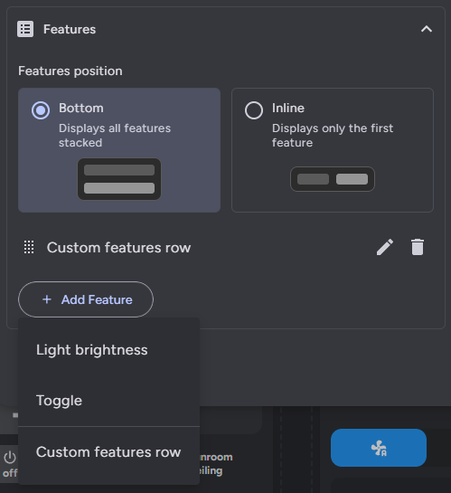
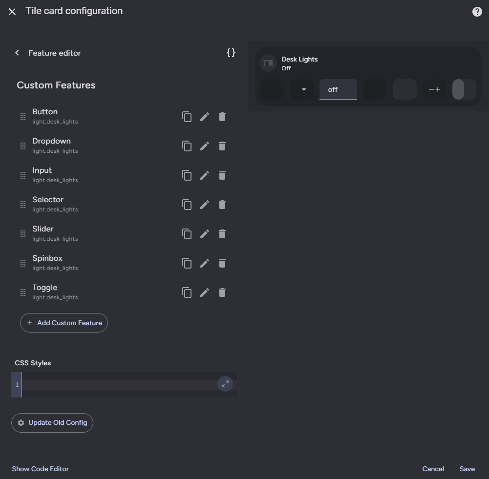
Within a custom features row you can add individual features using the add custom feature button. This works just like the top level add feature button but just for custom features. Each feature will look like a blank rectangle to start. Features can be reordered, copied, edited, and deleted from here.
You can also add CSS styles for the entire row here. CSS styles have to be encapsulated in a CSS selector like so.
:host {
  --mdc-icon-size: 32px;
}
By default, features will autofill with it's parent's entity information for tracking it's internal state. This can be disabled by toggling Autofill off at the feature level. Haptics can be similary enabled for a feature.
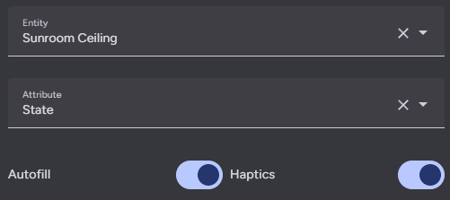
Every feature can have an entity assigned to it, which is used to track it's internal value. This value can then be used in styles and actions using templates, like {{ value | float }} By default the value will be derived from the entity state, but it can be changed to an attribute use the corresponding field.
Some additional logic is applied for certain attributes:
brightness- Converted from the default range of 0-255 to 0-100.media_position- Updated twice a second using the current timestamp and the attributemedia_position_updated_atwhen the entity state isplaying, and locked to a max value using the attributemedia_duration.elapsed- Only for timer entities. Updated twice a second using the the current timestamp and the attributesduration,remaining, andfinishes_at, and locked to a max value using the attributeduration.- Note:
elapsedis not an actual attribute of timer entities, but is a possiblevalue_attributefor timer entities for the purpose of displaying accurate timer elapsed values. Timer entities do have an attributeremaining, which only updates when the timer state changes. The actualremainingattribute can be calculated using theelapsedvalue and the timerdurationattribute.
- Note:
If you find that the autofilling of the entity ID in the action or feature value is causing issues, setting Autofill to false may help. Just remember to set the entity ID of the feature and the entity, device, area, or label ID of the action target.
Haptics are disabled for features by default, but can be toggled on at the feature level.
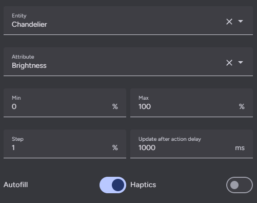
Inputs, sliders, and spinboxes have some additional general options. Both can have range Min and Max values defined by the user. These values default to 0 and 100 for sliders, spinboxes, and some input types. Sliders, spinboxes, and number type inputs can also have a Step size defined, which defaults to 1.
Inputs, sliders, and spinboxes will wait one second before updating their internal values from Home Assistant. This time can be changed by setting Update after action delay. Spinboxes will wait to fire their actions until a set amount of time after their buttons have stopped being pressed. This time defaults to one second and can be changed by setting Debounce time.
Inputs also have an Input Type field, which can be used to choose between many of the HTML input element types that have been optimized for use with this feature.
Dropdowns and selectors are made up of options, which can be added to, reordered, copied, deleted, and edited from a list similar to the overall features or custom features in a row. Dropdowns have dropdown options which can each have a single action, and selectors have buttons which can have multiple different actions.
Like sliders and spinboxes, selectors have a one second delay before updating their internal values from Home Assistant, which can be adjusted using Update after action delay.
While toggles are fairly simple, custom toggles have some extra options so you can customize their behavior. By default a toggle is considered on/checked if it's value (entity's state or attribute) is in the list true, yes, on, enable, enabled, 1, or if it's numerica cast is greater than zero. You can disable the numeric cast check with the option Check numeric value. You can also change the toggle check behavior to instead set the toggle state to off/unchecked if it's value is in the list false, no, off, disable, disabled, 0, undefined, null using the option Allow/Block checked values. If you want to make your toggle change it's state based on a value not in either of these lists or a limited list, you can use the Alternate checked values box to create an alternate allow or block list.
For default toggles and default styled custom toggles, you can swipe on them in the correct direction in addition to tapping them to actuate them. You can make it so that default styled custom toggles only activate on swipe. In addition to this, you can enable full swipe mode, where the toggle thumb will move as you drag it and will only activate if you drag it all the way to the other end of the toggle track. This makes it perform like a "swipe to unlock" switch.
All features can have a Label, Icon, and Units (dropdowns and selectors support these fields at the option level). These fields can also be set using templates. Like the overall custom features row, each custom feature can have it's CSS styles set (including using templates).
Toggles have two extra icons for checked and unchecked states. These icons appear in the background of the default toggle, within the box of the checkbox toggle, and on the thumb of the switch toggles.
Almost all fields support nunjucks templating. Nunjucks is a templating engine for JavaScript, which is heavily based on the jinja2 templating engine for Python which Home Assistant uses. While the syntax of nunjucks and jinja2 is almost identical, you may find the nunjucks documentation useful. Most extensions supported by Home Assistant templates are supported by this templating system, but not all and the syntax may vary. Please see the ha-nunjucks repository for a list of available extensions. If you want additional extensions to be added or have templating questions or bugs, please make an issue or discussion on that repository, not this one.
You can include the current value of a feature and it's units by using the variables value and unit in a label template. You can also include hold_secs in a template if performing a momentary end action. For toggles you can use the boolean variable checked to check whether the toggle is on or off. Each custom feature can also reference it's entry using config within templates. config.entity and config.attribute will return the features entity ID and attribute with their templates rendered (if they have them), and other templated config fields can be rendered within templates by wrapping them in the function render within a template. Information about the parent card such as it's entity ID, state, and attributes can be accessed using stateObj. The structure of stateObj can be found here as a HassEntity type and is listed below.
stateObj
type HassEntity {
  entity_id: string;
  state: string;
  attributes: {
    [key: string]: any;
  };
  last_changed: string;
  last_updated: string;
  attributes: {
    friendly_name?: string;
    unit_of_measurement?: string;
    icon?: string;
    entity_picture?: string;
    supported_features?: number;
    hidden?: boolean;
    assumed_state?: boolean;
    device_class?: string;
    state_class?: string;
    restored?: boolean;
  };
  context: {
    id: string;
    user_id?: string;
    parent_id?: string;
  };
}The custom features row and each custom feature within it has a code box for entering CSS styles.
General style options and custom feature specific properties can be set within the :host selector. You cannot set styles outside of a CSS selector.
:host {
  flex-basis: 200%;
  --color: red;
  --icon-color: blue;
}
All sub-elements within a custom feature are given easy to remember classes to apply additional styles to.
| Class Name | Element |
|---|---|
| .row | The custom features row that all custom features are contained within. |
| .container | A container within the custom feature to keep things organized. |
| .background | The background of the custom feature. |
| .icon | The icon of the custom feature. |
| .label | The label of the custom feature. |
| .thumb | The slider thumb element. |
| .active | The slider active area trailing thumb. |
| .tooltip | The slider tooltip, which appears when the slider is being interacted with. |
.background {
  background: blue;
}
.icon {
  --mdc-icon-size: 32px;
}
.label {
  color: red;
}
.tooltip {
  --tooltip-label: '{{ (value / 60) | int }}:{{ 0 if (value - 60*((value / 60) | int)) < 10 else "" }}{{ (value - 60*((value / 60) | int)) | int }}';
}
While any CSS property can be used, these values are internal CSS attributes used by custom features. You can choose to either use these values or to set these fields directly using class selectors for each sub-element.
| Name | Description |
|---|---|
| flex-basis | Percentage of the row the the feature should populate relative to it's siblings. Defaults to 100%. |
| --feature-color | Color of the feature. Inherited from the card, like tile icon color or climate mode color. |
| --feature-height | Height of the features. Defaults to 40px (pre 2024.8.0) or 42px (2024.8.0 or later). |
| --feature-border-radius | The border radius of custom features. Defaults to 12px. |
| --feature-button-spacing | The gap between custom features. Defaults to 12px. |
| --color | Color of the custom feature. |
| --opacity | Opacity of the custom feature. Defaults to 0.2. |
| --icon-color | Color of the icon. |
| --label-color | Color of the string label. |
| --icon-filter | Filter to apply to the icon color. |
| --label-filter | Filter to apply to the string label color. |
| --background | Color for the custom feature background. Sometimes equivalent to --color. |
| --background-opacity | Opacity of the feature background. Defaults to 0.2. |
Most features have additional custom CSS attributes which can be used to style them. I've also include their HTML below, so you can more easily style them directly using CSS selectors.
<custom-feature-button>
  #shadow-root
  <button class="background" part="button">
    ::before
    <md-ripple part="ripple"></md-ripple>
  </button>
  <ha-icon class="icon" part="icon"></ha-icon>
  <pre class="label" part="label"></pre>
</custom-feature-button>| Name | Description |
|---|---|
| --mdc-menu-item-height | Height of each dropdown option. |
| --mdc-theme-text-icon-on-background | Color of dropdown option icon in list. |
| --mdc-list-side-padding-left | Left padding of option. |
| --mdc-list-side-padding-right | Right padding of option. |
| --mdc-list-side-padding | Side padding of option, lower priority than above two. |
| --mdc-list-item-graphic-margin | Gap between option icon and label. |
<custom-feature-dropdown>
  #shadow-root
  <div class="container" part="container">
    <div class="background" part="background"></div>
    <div class="select" part="select">
      <ha-icon class="icon" part="icon"></ha-icon>
      <pre class="label" part="label"></pre>
      <md-ripple part="ripple"></md-ripple>
    </div>
    <ha-icon class="down-arrow" part="down-arrow"></ha-icon>
  </div>
  <div class="dropdown" part="dropdown">
    <custom-feature-dropdown-option
      id="option_A"
      class="selected option"
      part="dropdown-option"
    >
      #shadow-root
      <div class="background" part="background"></div>
      <div class="content" part="dropdown-option-content">
        <ha-icon class="icon" part="icon"></ha-icon>
        <pre class="label" part="label"></pre>
      </div>
    </custom-feature-dropdown-option>
    <custom-feature-dropdown-option
      id="option_B"
      class="option"
      part="dropdown-option"
    ></custom-feature-dropdown-option>
    <custom-feature-dropdown-option
      id="option_C"
      class="option"
      part="dropdown-option"
    ></custom-feature-dropdown-option>
  </div>
</custom-feature-dropdown><custom-feature-input>
#shadow-root
<div class="background" part="background"></div>
<ha-icon class="icon" part="icon"></ha-icon>
<div class="label-input">
<pre class="label" part="label"></pre>
<div class="input-unit">
<input
part="input"
tabindex="-1"
enterkeyhint="done"
type="text"
min="0"
max="255"
step="1"
value
/>
<span class="unit" part="unit">"#"</span>
</div>
</div>
<div class="line-ripple" part="ripple"></div>
</custom-feature-input>| Name | Description |
|---|---|
| --thumb-width | Width of the actual slider thumb, not including box shadow. Default varies by thumb style and browser. |
| --thumb-border-radius | Border radius of the slider thumb. Default varies by thumb style. |
| --thumb-translate | Thumb translation to match the input range position. Defaults to var(--thumb-offset) 0. |
| --thumb-transition | Thumb transition to animate the slider. Defaults to translate 180ms ease-in-out, background 180ms ease-in-out. |
| --tooltip-label | Tooltip label template, defaults to {{ value }}{{ unit }}. |
| --tooltip-transform | Tooltip location transform function, defaults to translate(var(--thumb-offset), -35px). |
| --tooltip-display | Tooltip display value, set to none to hide tooltip, defaults to initial. |
<custom-feature-slider>
  #shadow-root
  <div class="container on" part="container">
    <div class="background" part="background"></div>
    <input type="range" part="range" min="0" max="100" step="25" value="50" />
    <div part="thumb" class="thumb default">
      <div class="active"></div>
    </div>
    <div class="ticks">
      <div class="tick active" value="0">
      <div class="tick active" value="25">
      <div class="tick active" value="50">
      <div class="tick inactive" value="75">
      <div class="tick inactive" value="100">
    </div>
    <div class="icon-label">
      <ha-icon class="icon" part="icon"></ha-icon>
      <pre class="label" part="label"></pre>
    </div>
  </div>
  <div class="tooltip faded-out" part="tooltip">::after</div>
</custom-feature-slider>

<!-- Material Design 3 Slider -->
<custom-feature-slider>
  #shadow-root
  <div class="container on" part="container">
    <div class="background" part="background"></div>
    <input type="range" part="range" min="0" max="100" step="1" value="0" />
    <div part="thumb" class="thumb default">
      <div class="active"></div>
    </div>
    <div class="ticks">
      <div class="tick active" value="0">
      <div class="tick active" value="25">
      <div class="tick active" value="50">
      <div class="tick inactive" value="75">
      <div class="tick inactive" value="100">
    </div>
    <div class="icon-label">
      <ha-icon class="icon" part="icon"></ha-icon>
      <pre class="label" part="label"></pre>
    </div>
  <div class="tooltip faded-out" part="tooltip">::after</div>
  <div class="md3-thumb" part="md3-thumb">
      <div class="md3-thumb-active-track-corner"></div>
      <div class="md3-thumb-line"></div>
      <div class="md3-thumb-inactive-track-corner"></div>
    </div>
  </div>
</custom-feature-slider>| Name | Description |
|---|---|
| --color | Hover and selected background color of an option. |
| --hover-opacity | Opacity to use when hovering over an option. |
<custom-feature-selector>
  #shadow-root
  <div class="background" part="background"></div>
  <custom-feature-button
    id="option_A"
    class="option"
    part="selector-option"
  ></custom-feature-button>
  <custom-feature-button
    id="option_B"
    class="selected option"
    part="selector-option"
  ></custom-feature-button>
  <custom-feature-button
    id="option_C"
    class="option"
    part="selector-option"
  ></custom-feature-button>
</custom-feature-selector>| Name | Description |
|---|---|
| --checkbox-checked-border-color | Border color of checked checkboxes. |
| --checkbox-unchecked-border-color | Border color of unchecked checkboxes. |
| --checkbox-checked-icon-color | Icon color of checked checkboxes. |
| --checkbox-unchecked-icon-color | Icon color of unchecked checkboxes. |
| --switch-checked-button-color | Handle color of checked switches. |
| --switch-unchecked-button-color | Handle color of unchecked switches. |
| --switch-checked-button-state-layer | Hover/focused/pressed handle overlay color for checked Material Design 3 switches. |
| --switch-unchecked-button-state-layer | Hover/focused/pressed handle overlay color for unchecked Material Design 3 switches. |
| --switch-checked-track-color | Background color of checked switches. |
| --switch-unchecked-track-color | Background color of unchecked switches. |
| --switch-unchecked-track-state-layer | Hover/focused/pressed background overlay color for unchecked Material Design 3 switches |
| --switch-checked-icon-color | Icon color of checked switches. |
| --switch-unchecked-icon-color | Icon color of unchecked switches. |
<!-- Default -->
<custom-feature-toggle>
  #shadow-root
  <div class="container off" part="default-switch">
    <div class="background" part="background"></div>
    <ha-icon class="icon" part="icon"></ha-icon>
    <ha-icon class="icon" part="icon"></ha-icon>
    <div class="thumb" part="thumb">
      <ha-icon class="icon" part="icon"></ha-icon>
      <pre class="label" part="label"></pre>
    </div>
  </div>
  <custom-feature-toggle></custom-feature-toggle
></custom-feature-toggle>

<!-- Checkbox -->
<custom-feature-toggle style="justify-content: flex-end;">
  #shadow-root
  <div class="container on" part="checkbox">
    <div class="checkbox">
      <ha-icon class="icon" part="icon"></ha-icon>
    </div>
    <md-ripple part="ripple"></md-ripple>
  </div>
  <div class="icon-label">
    <ha-icon class="icon" part="icon"></ha-icon>
    <pre class="label" part="label"></pre>
  </div>
  <custom-feature-toggle></custom-feature-toggle
></custom-feature-toggle>

<!-- Material Design 2 Switch -->
<custom-feature-toggle style="justify-content: flex-end;">
  #shadow-root
  <div class="icon-label">
    <ha-icon class="icon" part="icon"></ha-icon>
    <pre class="label" part="label"></pre>
  </div>
  <div class="container md2-switch on" part="md2-switch">
    <div class="background" part="background"></div>
    <div class="thumb" part="thumb">
      ::before
      <ha-icon class="icon" part="icon"></ha-icon>
      <md-ripple part="ripple"></md-ripple>
    </div>
  </div>
  <custom-feature-toggle></custom-feature-toggle
></custom-feature-toggle>

<!-- Material Design 3 Switch -->
<custom-feature-toggle style="justify-content: flex-end;">
  #shadow-root
  <div class="icon-label">
    <ha-icon class="icon" part="icon"></ha-icon>
    <pre class="label" part="label"></pre>
  </div>
  <div class="container md3-switch off" part="md3-switch">
    <div class="background" part="background"></div>
    <div class="thumb" part="thumb">
      ::before
      <ha-icon class="icon" part="icon"></ha-icon>
      <md-ripple></md-ripple>
    </div>
  </div>
  <custom-feature-toggle></custom-feature-toggle
></custom-feature-toggle>There are three traditional interactions supported by Home Assistant - tap, double tap, and hold. Buttons, selector options, and spinbox buttons support all three. Dropdown options, sliders, and toggles only support tap actions. While you can swipe horizontally on the default toggle this is considered a tap action. Defining a double tap action that is not none introduces a 200ms delay to single tap actions.
Each action also supports the confirmation field. More information on Home Assistant action confirmations can be found here.
When setting the action for a slider or spinbox, you must use value within a template in the action data to use the feature value in action. For convenience, a codebox for the action will be displayed below the normal action options.

Actions follow the Home Assistant actions syntax. All Home Assistant actions are supported along with some additional ones.
| Action | Description |
|---|---|
| More info | Open the more info dialog. |
| Toggle | Toggle between the target's on and off (or similar) states. |
| Navigate | Navigate to another Home Assistant page. |
| URL | Navigate to an external URL. |
| Perform action | Call any Home Assistant service action. |
| Assist | Open the assist dialog. Uses the mobile dialog if available, like in the Home Assistant app. The pipeline ID and start listening options only work in the mobile assist dialog. |
| Fire DOM event | Fire a browser dom event using the action object as the event detail. Useful for opening browser mod popup cards. Note: Home Assistant hardcodes the event type to ll-custom. For other events use the action Evaluate JS. |
| Evaluate JS | Evaluate a string as JavaScript code. You have access to the custom feature via this, which includes this.hass, this.config, and this.value. Potentially dangerous, do not do something dumb like call actions in a loop with no delay which can crash your browser or server. |
| Repeat | Repeat the tap action ten times a second while held. Only applicable to hold. |
| No action | Explicilty set a command to do nothing. |
The entire action data and target fields are templatable, meaning that you can define the entire field as a YAML string in a template like so:
action: light.turn_{{ iif(checked, 'on', 'off') }}
data: |
  {% if checked %}
  brightness_pct: 100
{% endif %}Double tap and hold actions have user adjustable timings to change how they are triggered.
Hold actions are triggered by holding down on a button for a defined amount of time and then releasing. The default amount of time is 500ms. You can change this by setting Hold time in the hold action to a different number.
By setting a hold action to repeat, the tap action will repeat while the button is held down. The default delay between repeats is 100ms. You can change this by setting Repeat delay in the hold action to a different number. See the below section on repeat for more.
Double tap actions have a default window of 200ms to trigger before a single tap action is triggered instead. You can change this by setting Double tap window in the double tap action to a different number.
Note: Setting Double tap window above or too close to Hold time can result in undesirable behavior, as the hold timer expires before the double tap timer does. If you increase the Double tap window you should also increase Hold time to not be too close to it by at least 100ms if not more. In a custom feature without a hold action defined, you can set Hold behavior explicitly to Nothing to render the Hold time field.
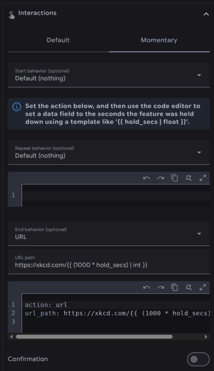
As an alternative to normal tap, hold, and double tap actions, buttons, including those within selectors and spinboxes, can also be used in a momentary mode. Configuring this option disables the normal tap, hold, and double tap actions.
The momentary start action is fired when you first press down on a button. The momentary end action is fired when you release the button. While these are meant to be used together you can use one or the other.
You can include the number of seconds a button has been held down using hold_secs in a template. For convenience, the momentary end action YAML is included in a code box below the action, like shown above.
While all configuration can now be done through the user interface, these YAML examples can provide some insight on how to do some advanced styling and templating.
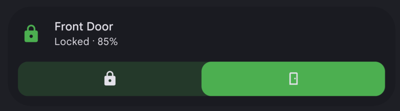
A lock tile with a toggle.
Config
features:
- type: custom:service-call
entries:
- type: toggle
entity_id: lock.front_door_ble
value_attribute: state
styles: |-
:host {
--color: var(--feature-color);
}
tap_action:
action: toggle
target:
entity_id: lock.front_door_ble
data: {}
checked_values:
- locked
checked_icon: mdi:lock
unchecked_icon: mdi:lock-open-outline
icon: mdi:door
type: tile
entity: lock.front_door_ble
show_entity_picture: false
vertical: false
layout_options:
grid_columns: 4
grid_rows: 2
features_position: bottom
card_mod:
style:
ha-tile-info$: |
.secondary:after {
visibility: visible;
content: " ⸱ {{ states('sensor.front_door_battery_level') }}%";
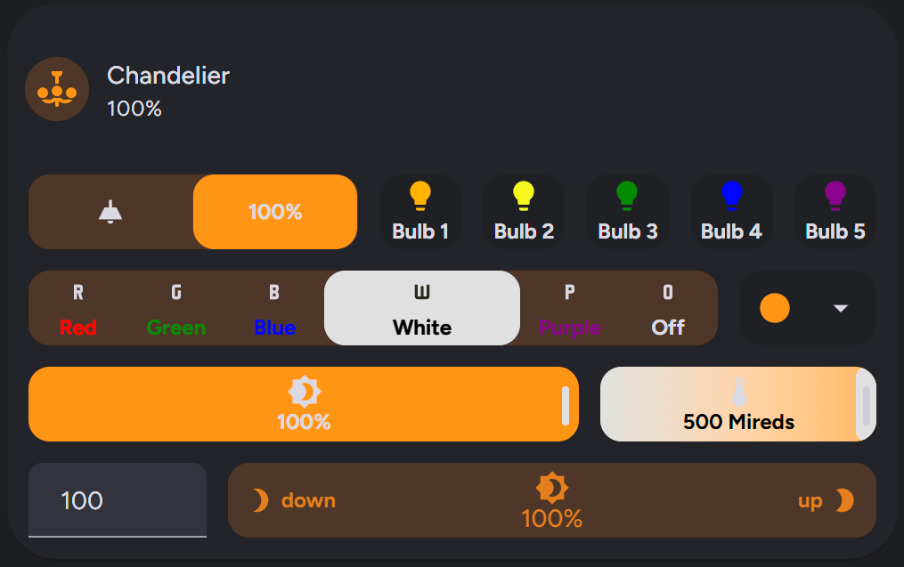
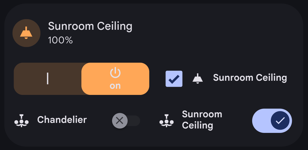
}A light tile with a button for each bulb, a color selector and dropdown, brightness and temperature sliders, and a brightness spinbox with emphasis on certain options.
Config
features:
- type: custom:service-call
entries:
- type: toggle
tap_action:
action: perform-action
confirmation:
text: >-
Are you sure you want to turn the light {{ 'on' if checked else
'off' }}?
exemptions: []
target:
entity_id:
- light.chandelier
perform_action: light.turn_{{ 'on' if checked else 'off' }}
data: |
{% if checked %}
kelvin: 2000
{% endif %}
icon: ''
label: >-
{{ value if checked else states(config.entity) }}{{ unit if checked
else "" }}
value_attribute: brightness
unit_of_measurement: '%'
autofill_entity_id: true
entity_id: light.chandelier
styles: |-
:host {
flex-basis: 400%;
}
haptics: true
unchecked_icon: mdi:ceiling-light-outline
checked_icon: mdi:ceiling-light
- tap_action:
action: call-service
service: light.toggle
target:
entity_id: light.chandelier_bulb_1
icon: mdi:lightbulb
label: Bulb 1
entity_id: light.chandelier
type: button
value_attribute: state
styles: |-
:host {
--icon-color: orange;
}
- tap_action:
action: call-service
service: light.toggle
target:
entity_id: light.chandelier_bulb_2
icon: mdi:lightbulb
label: Bulb 2
entity_id: light.chandelier
type: button
value_attribute: state
styles: |-
:host {
--icon-color: yellow;
}
- tap_action:
action: call-service
service: light.toggle
target:
entity_id: light.chandelier_bulb_3
icon: mdi:lightbulb
label: Bulb 3
entity_id: light.chandelier
type: button
value_attribute: state
styles: |-
:host {
--icon-color: green;
}
- tap_action:
action: call-service
service: light.toggle
target:
entity_id: light.chandelier_bulb_4
icon: mdi:lightbulb
label: Bulb 4
entity_id: light.chandelier
type: button
value_attribute: state
styles: |-
:host {
--icon-color: blue;
}
- tap_action:
action: call-service
service: light.toggle
target:
entity_id: light.chandelier_bulb_5
icon: mdi:lightbulb
label: Bulb 5
entity_id: light.chandelier
type: button
value_attribute: state
styles: |-
:host {
--icon-color: purple;
}
styles: ''
- type: custom:service-call
entries:
- type: selector
entity_id: light.chandelier
value_attribute: rgb_color
options:
- tap_action:
action: call-service
service: light.turn_on
data:
color_name: red
target:
entity_id: light.chandelier
confirmation: true
option: 255,0,0
label: Red
icon: mdi:alpha-r
entity_id: light.chandelier
type: button
value_attribute: state
styles: |
:host {
--label-color: red;
--color: red;
{% if (state_attr(config.entity, "rgb_color") or []).join(',') == '255,0,0' %}
--label-filter: invert(1);
{% endif %}
}
- tap_action:
action: call-service
service: light.turn_on
data:
color_name: green
target:
entity_id: light.chandelier
option: 0,255,0
label: Green
icon: mdi:alpha-g
entity_id: light.chandelier
type: button
value_attribute: state
styles: |-
:host {
--label-color: green;
--color: green;
{% if (state_attr(config.entity, "rgb_color") or []).join(',') == '0,255,0' %}
--label-filter: invert(1);
{% endif %}
}
- tap_action:
action: call-service
service: light.turn_on
data:
color_name: blue
target:
entity_id: light.chandelier
option: 11,0,255
label: Blue
icon: mdi:alpha-b
entity_id: light.chandelier
type: button
value_attribute: state
styles: |-
:host {
--label-color: blue;
--color: blue;
{% if (state_attr(config.entity, "rgb_color") or []).join(',') == '11,0,255' %}
--label-filter: invert(1);
{% endif %}
}
- tap_action:
action: call-service
service: light.turn_on
data:
color_temp: 500
target:
entity_id: light.chandelier
option: 255,137,14
label: White
icon: mdi:alpha-w
entity_id: light.chandelier
type: button
value_attribute: state
styles: |-
:host {
flex-basis: 200%;
--label-color: white;
--color: white;
{% if (state_attr(config.entity, "rgb_color") or []).join(',') == '255,137,14' %}
--label-filter: invert(1);
--icon-filter: invert(1);
{% endif %}
}
- tap_action:
action: call-service
service: light.turn_on
target:
entity_id: light.chandelier
data:
color_name: purple
option: 254,11,255
label: Purple
icon: mdi:alpha-p
entity_id: light.chandelier
type: button
value_attribute: state
styles: |-
:host {
--label-color: purple;
--color: purple;
{% if (state_attr(config.entity, "rgb_color") or []).join(',') == '254,11,255' %}
--label-filter: invert(1);
{% endif %}
}
- entity_id: light.chandelier
option: 'null'
tap_action:
action: perform-action
perform_action: light.turn_off
target:
entity_id:
- light.chandelier
data: {}
label: 'Off'
icon: mdi:alpha-o
styles: |
:host {
{% if (state_attr(config.entity, "rgb_color") or []).join(',') == '255,0,0' %}
--label-filter: invert(1);
{% endif %}
}
styles: |-
:host {
flex-basis: 500%;
}
.background {
{% if is_state(config.entity, "on") %}
--background: rgb({{ state_attr(config.entity, "rgb_color") }});
{% endif %}
}
- type: dropdown
entity_id: light.chandelier
options:
- entity_id: light.chandelier
option: 255,137,14
tap_action:
action: perform-action
perform_action: light.turn_on
target:
entity_id: light.chandelier
data:
brightness_pct: 100
kelvin: 2000
icon: mdi:checkbox-blank-circle
styles: |-
.icon {
color: rgb(255,137,14);
}
- entity_id: light.chandelier
option: 255,0,0
tap_action:
action: perform-action
perform_action: light.turn_on
target:
entity_id:
- light.chandelier
data:
brightness_pct: 100
color_name: red
confirmation: true
icon: mdi:checkbox-blank-circle
styles: |-
.icon {
color: var(--red-color);
}
- entity_id: light.chandelier
option: 0,255,0
tap_action:
action: perform-action
perform_action: light.turn_on
target:
entity_id:
- light.chandelier
data:
brightness_pct: 100
color_name: green
confirmation: false
icon: mdi:checkbox-blank-circle
styles: |-
.icon {
color: var(--green-color);
}
- entity_id: light.chandelier
option: 11,0,255
tap_action:
action: perform-action
perform_action: light.turn_on
target:
entity_id:
- light.chandelier
data:
brightness_pct: 100
color_name: blue
icon: mdi:checkbox-blank-circle
styles: |-
.icon {
color: var(--blue-color);
}
- entity_id: light.chandelier
option: 254,11,255
tap_action:
action: perform-action
perform_action: light.turn_on
target:
entity_id:
- light.chandelier
data:
rgb_color:
- 128
- 0
- 128
brightness_pct: 100
icon: mdi:checkbox-blank-circle
styles: |-
.icon {
color: var(--purple-color);
}
- entity_id: light.chandelier
tap_action:
action: perform-action
perform_action: light.turn_off
target:
entity_id:
- light.chandelier
data: {}
icon: mdi:checkbox-blank-circle-outline
styles: ''
option: 'null'
value_attribute: rgb_color
styles: |-
.option {
min-width: 0;
}
styles: ''
- type: custom:service-call
entries:
- type: slider
label: '{{ value }}{{ unit }}'
unit_of_measurement: '%'
value_attribute: brightness
icon: mdi:brightness-4
tap_action:
action: call-service
service: light.turn_on
data:
brightness_pct: '{{ value }}'
target:
entity_id: light.chandelier
entity_id: light.chandelier
styles: |
:host {
flex-basis: 200%;
}
range:
- 0
- 100
step: 1
thumb: default
- type: slider
thumb: line
value_attribute: color_temp
tap_action:
action: call-service
service: light.turn_on
target:
entity_id: light.chandelier
data:
color_temp: '{{ value }}'
confirmation: true
label: '{{ value }}{{ unit }}'
unit_of_measurement: ' Mireds'
icon: mdi:thermometer
range:
- '{{ state_attr("light.chandelier", "min_mireds") }}'
- '{{ state_attr("light.chandelier", "max_mireds") }}'
step: 1
entity_id: light.chandelier
styles: |-
:host {
--label-color: var(--disabled-color);
--background: linear-gradient(-90deg, rgb(255, 167, 87), rgb(255, 255, 251));
--background-opacity: 1;
}
styles: ''
- type: custom:service-call
entries:
- type: input
entity_id: light.chandelier
tap_action:
action: perform-action
target:
entity_id:
- light.chandelier
perform_action: light.turn_on
data:
brightness_pct: '{{ value | int }}'
range:
- 0
- 100
styles: ''
value_attribute: brightness
thumb: number
- type: spinbox
haptics: true
icon: mdi:brightness-4
unit_of_measurement: '%'
label: '{{ value }}{{ unit }}'
step: 1
range:
- 0
- 100
value_attribute: brightness
tap_action:
action: call-service
service: light.turn_on
data:
brightness_pct: '{{ value | float }}'
target:
entity_id: light.chandelier
decrement:
icon: mdi:brightness-3
label: down
hold_action:
action: repeat
entity_id: light.chandelier
type: button
value_attribute: state
styles: |-
:host {
flex-flow: row;
}
.icon {
padding-right: 4px;
}
increment:
icon: mdi:brightness-2
label: up
hold_action:
action: repeat
entity_id: light.chandelier
type: button
value_attribute: state
styles: |-
:host {
flex-flow: row-reverse;
}
.icon {
padding-left: 4px;
}
hold_action:
action: repeat
entity_id: light.chandelier
styles: |-
:host {
flex-basis: 500%;
--light-color: rgb({{ state_attr(config.entity, "rgb_color") }});
--on-color: {{ "var(--light-color)" if is_state(config.entity, "on") else "initial" }};
--background: var(--on-color);
--icon-color: var(--on-color);
--label-color: var(--on-color);
}
debounce_time: 1004
type: tile
entity: light.chandelier
layout_options:
grid_columns: 4
grid_rows: 5
icon_tap_action:
action: perform-action
perform_action: light.toggle
target:
entity_id: light.chandelier
confirmation: true
features_position: bottom
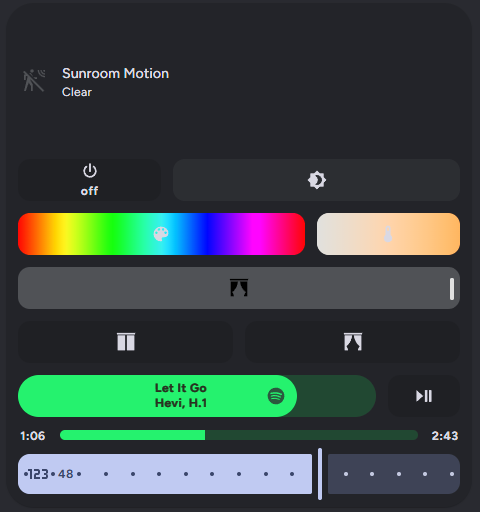
vertical: falseMultiple sliders for a room's light, curtains, and media control.
Config
features:
  - type: custom:service-call
    entries:
      - type: button
        haptics: true
        tap_action:
          action: perform-action
          perform_action: light.turn_on
          data:
            entity_id: light.sunroom_ceiling
            color_name: red
        double_tap_action:
          action: perform-action
          perform_action: light.turn_on
          xdouble_tap_window: 1000
          data:
            entity_id: light.sunroom_ceiling
            color_name: green
        hold_action:
          action: perform-action
          perform_action: light.turn_on
          xhold_time: 2000
          data:
            entity_id: light.sunroom_ceiling
            color_name: blue
        icon: mdi:power
        label: '{{ states(config.entity) }}'
        entity_id: light.sunroom_ceiling
        value_attribute: state
        styles: |-
          :host {
            {% if is_state(config.entity, "on") %}
            --color: rgb({{ state_attr(config.entity, "rgb_color") }});
            {% endif %};
          }
      - type: slider
        haptics: true
        label: '{{ value }}{{ unit }}'
        unit_of_measurement: '%'
        value_attribute: brightness
        icon: mdi:brightness-4
        tap_action:
          action: perform-action
          perform_action: light.turn_on
          data:
            brightness_pct: '{{ value | int }}'
          target:
            entity_id: light.sunroom_ceiling
        entity_id: light.sunroom_ceiling
        range:
          - 0
          - 100
        step: 1
        thumb: default
        styles: |
          :host {
            flex-basis: 200%;
            {% if is_state(config.entity, "on") %}
            --color: rgb({{ state_attr(config.entity, "rgb_color") }})
            {% endif %}
          }
          .tooltip {
            {% if is_state(config.entity, "off") %}
            display: none;
            {% endif %}
          }
  - type: custom:service-call
    entries:
      - type: slider
        thumb: line
        range:
          - 0
          - 360
        step: 0.1
        value_attribute: Hs color[0]
        icon: mdi:palette
        tap_action:
          action: perform-action
          target:
            entity_id: light.sunroom_ceiling
          data:
            hs_color:
              - '{{ value }}'
              - 100
          perform_action: light.turn_on
        entity_id: light.sunroom_ceiling
        styles: |-
          :host {
            flex-basis: 200%;
            --background: linear-gradient(to right, #f00 0%, #ff0 17%, #0f0 33%, #0ff 50%, #00f 66%, #f0f 83%, #f00 100%);
            --background-opacity: 1;
          }
          .tooltip {
            background: hsl({{ value }}, 100%, 50%);
          }
      - type: slider
        thumb: line
        value_attribute: color_temp
        tap_action:
          action: perform-action
          perform_action: light.turn_on
          data:
            color_temp: '{{ value }}'
            entity_id: light.sunroom_ceiling
        label: '{{ value }}{{ unit }}'
        unit_of_measurement: ' Mireds'
        icon: mdi:thermometer
        range:
          - '{{ state_attr(config.entity, "min_mireds") }}'
          - '{{ state_attr(config.entity, "max_mireds") }}'
        step: 1
        styles: |-
          :host {
            --background: linear-gradient(-90deg, rgb(255, 167, 87), rgb(255, 255, 251)); --background-opacity: 1; --label-color: var(--disabled-color);
          }
        autofill_entity_id: true
        entity_id: light.sunroom_ceiling
  - type: custom:service-call
    entries:
      - type: slider
        tap_action:
          action: perform-action
          perform_action: cover.set_cover_position
          data:
            position: '{{ value }}'
            entity_id: cover.sunroom_curtains
        value_attribute: current_position
        icon: mdi:curtains
        entity_id: cover.sunroom_curtains
        styles: |-
          :host {
            --color: var(--feature-color);
            --icon-color: var(--disabled-color);
          }
        range:
          - 0
          - 100
        step: 1
  - type: custom:service-call
    entries:
      - type: slider
        entity_id: media_player.spotify
        tap_action:
          action: perform-action
          perform_action: media_player.volume_set
          data:
            volume_level: '{{ value }}'
          target:
            entity_id: media_player.spotify
        value_attribute: volume_level
        icon: mdi:spotify
        label: |
          {{ state_attr(config.entity, "media_title") }}
          {{ state_attr(config.entity, "media_artist") }}
        range:
          - 0
          - 1
        thumb: round
        styles: |-
          :host {
            --color: rgb(31, 223, 100);
            flex-direction: row;
            border-radius: 42px;
            --tooltip-label: '{{ (value * 100) | int }}%';
            flex-basis: 500%;
          }
          .icon {
            color: rgb(37, 79, 55);
            padding: 8px;
            flex: auto;
            position: absolute;
            transform: translateX(var(--thumb-offset));
          }
          .label {
            left: -16px;
          }
        step: 0.01
      - type: button
        entity_id: media_player.spotify
        icon: mdi:play-pause
        tap_action:
          action: perform-action
          perform_action: media_player.media_play_pause
          data: {}
          target:
            entity_id: media_player.spotify
        double_tap_action:
          action: perform-action
          perform_action: script.spotify_refresh_every_5_seconds_for_30_seconds
          target:
            entity_id: media_player.spotify
        value_attribute: state
        styles: ''
  - type: custom:service-call
    entries:
      - type: button
        entity_id: media_player.spotify
        value_attribute: media_position
        tap_action:
          action: perform-action
          perform_action: media_player.media_previous_track
          target:
            entity_id: media_player.spotify
        label: >-
          {% set minutes = (value / 60) | int %} {% set seconds = (value - 60 *
          minutes) | int %} {{ minutes }}:{{ 0 if seconds < 10 else "" }}{{
          seconds | int }}
        styles: |-
          :host {
            overflow: visible;
            height: 12px;
            border-radius: 0px;
            --color: none;
          }
      - type: slider
        tap_action:
          action: perform-action
          perform_action: media_player.media_seek
          data:
            seek_position: '{{ value }}'
          target:
            entity_id: media_player.spotify
        entity_id: media_player.spotify
        value_attribute: media_position
        value_from_hass_delay: 5000
        range:
          - 0
          - '{{ state_attr(config.entity, "media_duration") }}'
        step: 1
        thumb: flat
        styles: |-
          :host {
            --color: rgb(31, 223, 100);
            --tooltip-label: '{{ (value / 60) | int }}:{{ 0 if (value - 60*((value / 60) | int)) < 10 else "" }}{{ (value - 60*((value / 60) | int)) | int }}';
            --thumb-width: 1px;
            flex-basis: 1200%;
            height: 10px;
          }
      - type: button
        entity_id: media_player.spotify
        value_attribute: media_position
        tap_action:
          action: perform-action
          perform_action: media_player.media_next_track
          target:
            entity_id: media_player.spotify
        label: >-
          {{ (state_attr(config.entity, "media_duration") / 60) | int }}:{{ 0 if
          (state_attr(config.entity, "media_duration") -
          60*((state_attr(config.entity, "media_duration") / 60) | int)) < 10
          else "" }}{{ (state_attr(config.entity, "media_duration") -
          60*((state_attr(config.entity, "media_duration") / 60) | int)) | int
          }}
        styles: |-
          :host {
            overflow: visible;
            height: 12px;
            border-radius: 0px;
            --color: none;
          }
type: tile
entity: binary_sensor.sun_room
color: accent
icon: ''
layout_options:
  grid_columns: 4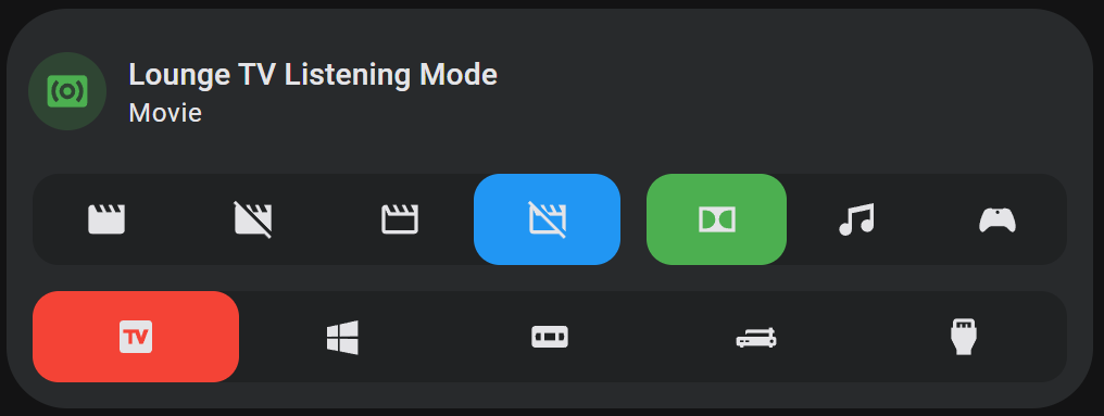
grid_rows: 6Selectors for input selects. Note that the opacity of selector buttons is set to 0 by default, so they are completely transparent against the selector background.
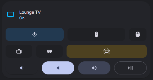
Config
features:
  - type: custom:service-call
    entries:
      - type: selector
        entity_id: input_select.lounge_tv_theater_mode
        options:
          - icon: mdi:movie
            entity_id: input_select.lounge_tv_theater_mode
            option: Theater
            tap_action:
              action: perform-action
              perform_action: input_select.select_option
              data:
                option: Theater
              target:
                entity_id: input_select.lounge_tv_theater_mode
            type: button
            value_attribute: state
            styles: ''
          - icon: mdi:movie-off
            entity_id: input_select.lounge_tv_theater_mode
            option: Light
            tap_action:
              action: perform-action
              perform_action: input_select.select_option
              data:
                option: Light
              target:
                entity_id: input_select.lounge_tv_theater_mode
            type: button
            value_attribute: state
            styles: ''
          - icon: mdi:movie-outline
            entity_id: input_select.lounge_tv_theater_mode
            option: Dark
            tap_action:
              action: perform-action
              perform_action: input_select.select_option
              data:
                option: Dark
              target:
                entity_id: input_select.lounge_tv_theater_mode
            type: button
            value_attribute: state
            styles: ''
          - icon: mdi:movie-off-outline
            entity_id: input_select.lounge_tv_theater_mode
            option: 'Off'
            tap_action:
              action: perform-action
              perform_action: input_select.select_option
              data:
                option: 'Off'
              target:
                entity_id: input_select.lounge_tv_theater_mode
            type: button
            value_attribute: state
            styles: ''
        value_attribute: state
        styles: |-
          :host {
            --color: var(--blue-color);
            flex-basis: 140%;
          }
      - type: selector
        entity_id: input_select.lounge_tv_listening_mode
        options:
          - icon: mdi:dolby
            entity_id: input_select.lounge_tv_listening_mode
            option: Movie
            tap_action:
              action: perform-action
              perform_action: input_select.select_option
              data:
                option: Movie
              target:
                entity_id: input_select.lounge_tv_listening_mode
            type: button
            value_attribute: state
            styles: ''
          - icon: mdi:music
            entity_id: input_select.lounge_tv_listening_mode
            option: Music
            tap_action:
              action: perform-action
              perform_action: input_select.select_option
              data:
                option: Music
              target:
                entity_id: input_select.lounge_tv_listening_mode
            type: button
            value_attribute: state
            styles: ''
          - icon: mdi:microsoft-xbox-controller
            entity_id: input_select.lounge_tv_listening_mode
            option: Game
            tap_action:
              action: perform-action
              perform_action: input_select.select_option
              data:
                option: Game
              target:
                entity_id: input_select.lounge_tv_listening_mode
            type: button
            value_attribute: state
            styles: ''
        value_attribute: state
        styles: ''
  - type: custom:service-call
    entries:
      - type: selector
        entity_id: input_select.lounge_tv_source
        options:
          - icon: mdi:television-box
            entity_id: input_select.lounge_tv_source
            option: Google TV
            tap_action:
              action: perform-action
              perform_action: input_select.select_option
              data:
                option: Google TV
              target:
                entity_id: input_select.lounge_tv_source
            type: button
            value_attribute: state
            styles: ''
          - icon: mdi:microsoft-windows
            entity_id: input_select.lounge_tv_source
            option: HTPC
            tap_action:
              action: perform-action
              perform_action: input_select.select_option
              data:
                option: HTPC
              target:
                entity_id: input_select.lounge_tv_source
            type: button
            value_attribute: state
            styles: ''
          - icon: mdi:vhs
            entity_id: input_select.lounge_tv_source
            option: DVD/VHS
            tap_action:
              action: perform-action
              perform_action: input_select.select_option
              data:
                option: DVD/VHS
              target:
                entity_id: input_select.lounge_tv_source
            type: button
            value_attribute: state
            styles: ''
          - icon: mdi:record-player
            entity_id: input_select.lounge_tv_source
            option: Vinyl
            tap_action:
              action: perform-action
              perform_action: input_select.select_option
              data:
                option: Vinyl
              target:
                entity_id: input_select.lounge_tv_source
            type: button
            value_attribute: state
            styles: ''
          - icon: mdi:video-input-hdmi
            entity_id: input_select.lounge_tv_source
            option: External
            tap_action:
              action: perform-action
              perform_action: input_select.select_option
              data:
                option: External
              target:
                entity_id: input_select.lounge_tv_source
            type: button
            value_attribute: state
            styles: ''
        value_attribute: state
        styles: |-
          :host {
            --color: var(--red-color);
          }
type: tile
entity: input_select.lounge_tv_listening_mode
color: green
layout_options:
  grid_columns: 4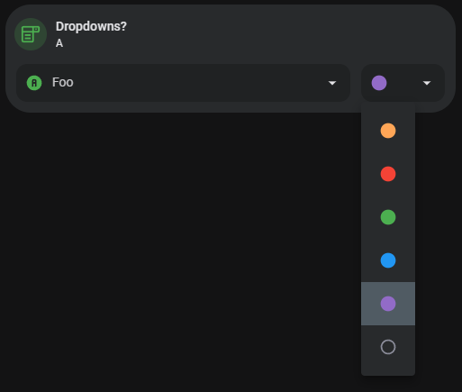
grid_rows: 3Using a selector to display different features in a custom features card.
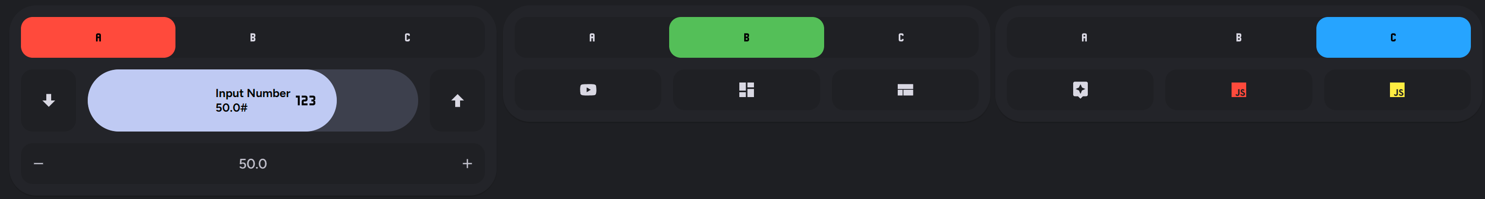
Config
features:
  - type: custom:service-call
    entries:
      - type: selector
        options:
          - option: A
            icon: mdi:alpha-{{ config.option | lower }}
            styles: |-
              :host {
                --icon-color: {{ "var(--disabled-color)" if is_state(config.entity, config.option) }};
                --color: var(--red-color);
              }
            entity_id: input_select.select_test
            tap_action:
              action: call-service
              service: input_select.select_option
              data:
                option: A
              target:
                entity_id: input_select.select_test
            type: button
            value_attribute: state
            haptics: false
          - option: B
            icon: mdi:alpha-{{ config.option | lower }}
            entity_id: input_select.select_test
            tap_action:
              action: call-service
              service: input_select.select_option
              data:
                option: B
              target:
                entity_id: input_select.select_test
            type: button
            value_attribute: state
            styles: |-
              :host {
                --icon-color: {{ "var(--disabled-color)" if is_state(config.entity, config.option) }};
                --color: var(--green-color);
              }
          - option: C
            icon: mdi:alpha-{{ config.option | lower }}
            entity_id: input_select.select_test
            tap_action:
              action: call-service
              service: input_select.select_option
              data:
                option: C
              target:
                entity_id: input_select.select_test
              confirmation: true
            type: button
            value_attribute: state
            styles: |-
              :host {
                --icon-color: {{ "var(--disabled-color)" if is_state(config.entity, config.option) }};
                --color: var(--blue-color);
              }
        entity_id: input_select.select_test
        value_attribute: state
        styles: ''
        autofill_entity_id: true
        haptics: true
        value_from_hass_delay: 1000
    styles: ''
  - type: custom:service-call
    entries:
      - type: button
        icon: mdi:arrow-down-bold
        tap_action:
          action: perform-action
          data: {}
          target:
            entity_id: input_number.slider_test
          perform_action: input_number.decrement
        hold_action:
          action: repeat
          repeat_delay: 10
        entity_id: input_number.slider_test
        value_attribute: state
        styles: ''
      - type: slider
        thumb: round
        entity_id: input_number.slider_test
        label: |
          Input Number
          {{ value }}{{ unit }}
        unit_of_measurement: '#'
        icon: mdi:numeric
        styles: |-
          :host {
            flex-basis: 600%;
            --tooltip-label: "The number is {{ value }}";
            --label-color: var(--disabled-color);
          }
          .icon {
            color: var(--disabled-color);
            padding: 8px;
            flex: auto;
            position: absolute;
            translate: var(--thumb-translate);
            transition: var(--thumb-transition);
            --mdc-icon-size: 24px;
          }

          {% if value == config.range[0] %}
          .thumb {
            visibility: hidden;
          }
          .icon {
            visibility: hidden;
          }
          {% endif %}
        range:
          - -128
          - 128
        tap_action:
          action: perform-action
          target:
            entity_id:
              - input_number.slider_test
          data:
            value: '{{ value | int }}'
          confirmation: false
          perform_action: input_number.set_value
        autofill_entity_id: true
        step: 0.5
        value_attribute: state
      - type: button
        icon: mdi:arrow-up-bold
        action: call-service
        haptics: true
        hold_action:
          action: repeat
          repeat_delay: 10
        entity_id: input_number.slider_test
        tap_action:
          action: perform-action
          target:
            entity_id:
              - input_number.slider_test
          perform_action: input_number.increment
          data: {}
        value_attribute: state
        styles: ''
    styles: |-
      :host {
        --feature-height: 64px;
      }

      {% if not is_state("input_select.select_test", "A")  %}
      :host {
        display: none;
      }
      {% endif %}
  - type: custom:service-call
    entries:
      - type: button
        icon: mdi:youtube
        tap_action:
          action: url
          url_path: youtube.com
        double_tap_action:
          action: url
          url_path: play.spotify.com
        entity_id: input_select.select_test
        value_attribute: state
        styles: ''
      - type: button
        icon: mdi:view-dashboard
        tap_action:
          action: navigate
          navigation_path: /lovelace/0
        double_tap_action:
          action: navigate
          navigation_path: /lovelace-extra/0
        entity_id: input_select.select_test
        value_attribute: state
        styles: ''
      - type: button
        icon: mdi:view-compact
        tap_action:
          action: navigate
          navigation_path: /lovelace-extra/subview
        entity_id: input_select.select_test
        value_attribute: state
        styles: ''
    styles: |-
      {% if not is_state("input_select.select_test", "B")  %}
      :host {
        display: none;
      }
      {% endif %}
  - type: custom:service-call
    entries:
      - type: button
        icon: mdi:assistant
        tap_action:
          action: assist
          pipeline_id: last_used
        label: ''
        entity_id: input_select.select_test
        value_attribute: state
        styles: ''
        double_tap_action:
          action: navigate
          navigation_path: '?conversation=1'
      - type: button
        tap_action:
          action: eval
          confirmation:
            text: This is a test of a Home Assistant confirmation with custom text
          eval: >-
            console.log("This was made using an exec call with a
            confirmation.");
        value_attribute: state
        styles: |-
          .icon {
            color: var(--red-color);
          }
        icon: mdi:language-javascript
        entity_id: input_select.select_test
      - type: button
        tap_action:
          action: eval
          confirmation: false
          eval: >-
            console.log("This was made using an exec call with no
            confirmation.");
        value_attribute: state
        styles: |-
          .icon {
            color: var(--yellow-color);
          }
        icon: mdi:language-javascript
        entity_id: input_select.select_test
    styles: |-
      {% if not  is_state("input_select.select_test", "C")  %}
      :host {
        display: none;
      }
      {% endif %}
  - type: custom:service-call
    entries:
      - type: spinbox
        tap_action:
          action: perform-action
          data:
            value: '{{ value | float }}'
          target:
            entity_id: input_number.slider_test
          perform_action: input_number.set_value
        range:
          - -128
          - 128
        step: 0.5
        label: '{{ value }}'
        hold_action:
          action: repeat
          repeat_delay: 50
        autofill_entity_id: true
        decrement:
          entity_id: input_number.slider_test
          type: button
          value_attribute: state
          styles: ''
        entity_id: input_number.slider_test
        increment:
          entity_id: input_number.slider_test
          type: button
          value_attribute: state
          styles: ''
          haptics: true
        value_attribute: state
        styles: ''
        haptics: false
    styles: |-
      {% if not is_state("input_select.select_test", "A")  %}
      :host {
        display: none;
      }
      {% endif %}
type: custom:custom-features-cardA better looking temperature spinbox with hold on repeat, tile color, and an icon and label. Also an XKCD button that opens a different comic based on how long you hold it using momentary button mode, and two buttons that change background color based on their state.
Config
features:
  - type: custom:service-call
    entries:
      - type: spinbox
        icon: mdi:thermometer
        label: '{{ value }}{{ unit }}'
        step: 1
        debounceTime: 1000
        range:
          - '{{ state_attr(config.entity, "min_temp") }}'
          - '{{ state_attr(config.entity, "max_temp") }}'
        value_attribute: temperature
        unit_of_measurement: °F
        hold_action:
          action: repeat
        entity_id: climate.downstairs_thermostat
        styles: |-
          :host {
            --background: var(--feature-color);
            --icon-color: var(--feature-color);
            flex-flow: row;
          }
        tap_action:
          action: perform-action
          perform_action: climate.set_temperature
          target:
            entity_id: climate.downstairs_thermostat
          data:
            temperature: '{{ value }}'
  - type: custom:service-call
    entries:
      - type: button
        label: XKCD
        value_from_hass_delay: 5000
        momentary_end_action:
          action: url
          url_path: https://xkcd.com/{{ 1000* hold_secs }}
        entity_id: climate.downstairs_thermostat
        value_attribute: state
  - type: custom:service-call
    entries:
      - type: button
        entity_id: sensor.cold_flu_index_today
        label: |-
          State Float
          {{ value }}
        value_attribute: state
        styles: ''
      - type: button
        entity_id: sensor.cold_flu_index_today
        label: |-
          State Float
          {{ value }}
        value_attribute: strep_index
        icon: ''
        styles: |-
          .background {
            --color: {{ "blue" if state_attr(config.entity, config.attribute) < 3 else "green" }};
          }
        tap_action:
          action: more-info
          target:
            entity_id: sensor.cold_flu_index_today
          confirmation:
            exemptions:
              - user: 7e9bf9d73edc48df8ece5cec7e9a4f00
              - user: af773a442cd7493f8178f7c23b7882d7
            text: Display Cold & Flu Index?
type: tile
entity: climate.downstairs_thermostat
layout_options:
  grid_columns: 4
grid_rows: 4A read only timer display with buttons and multiple labels.
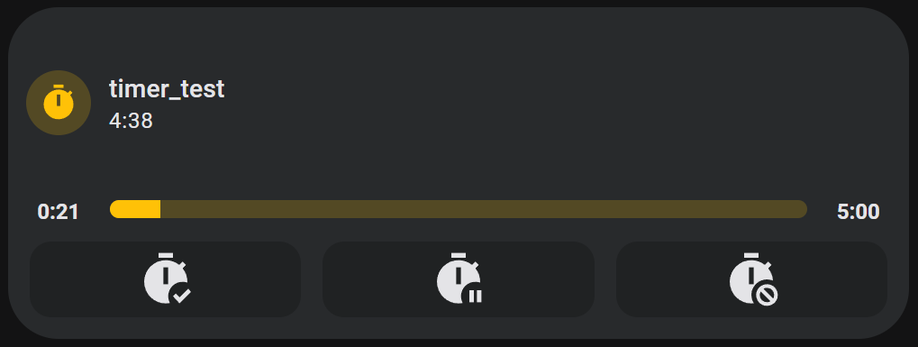
Config
features:
  - type: custom:service-call
    entries:
      - type: button
        value_attribute: elapsed
        label: >-
          {% set minutes = (value / 60) | int %} {% set seconds = (value - 60 *
          minutes) | int %} {{ minutes }}:{{ 0 if seconds < 10 else "" }}{{
          seconds | int }}
        styles: |-
          :host {
            overflow: visible;
            height: 12px;
            border-radius: 0px;
            --color: none;
          }
        entity_id: timer.timer_test
      - type: slider
        tap_action:
          action: none
        value_attribute: elapsed
        thumb: flat
        step: 1
        range:
          - 0
          - >-
            {% set hms = state_attr(config.entity, "duration").split(":") %} {{
            (hms[0] |int ) * 3600 + (hms[1] | int) * 60 + (hms[2] | int) }}
        styles: |-
          :host {
            flex-basis: 1200%;
            height: 10px;
            --thumb-width: 1px;
          }
        entity_id: timer.timer_test
      - type: button
        value_attribute: duration
        label: '{% set hms = value.split(":") %} {{ hms[1] | int }}:{{ hms[2] }}'
        styles: |-
          :host {
            overflow: visible;
            height: 12px;
            border-radius: 0px;
            --color: none;
          }
        entity_id: timer.timer_test
  - type: custom:service-call
    entries:
      - type: button
        icon: mdi:timer-check
        tap_action:
          action: perform-action
          perform_action: timer.start
          target:
            entity_id: timer.timer_test
        entity_id: timer.timer_test
        value_attribute: elapsed
      - type: button
        icon: mdi:timer-pause
        tap_action:
          action: perform-action
          perform_action: timer.pause
          target:
            entity_id: timer.timer_test
        entity_id: timer.timer_test
        value_attribute: elapsed
      - type: button
        icon: mdi:timer-cancel
        tap_action:
          action: perform-action
          perform_action: timer.cancel
          target:
            entity_id: timer.timer_test
        entity_id: timer.timer_test
        value_attribute: elapsed
    styles: |-
      :host {
        --mdc-icon-size: 32px;
      }
type: tile
entity: timer.timer_test
layout_options:
  grid_columns: 4
  grid_rows: 3