Is a modern image comparison slider written in vanilla JavaScript and has no dependencies on other libraries. Best for comparing images, image retouching, color adjustments, renderings, etc... It uses the requestAnimationFrame api for rendering.
(Started as a jQuery-Plugin back in the days (2013) and was used for a custom WordPress-Plugin)
| Vanilla JS | React |
|---|---|
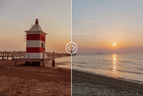
 |
 |
| vanilla JS | react component |
| Core JS library | React wrapper for easy integration |
DOCUMENTARY (API) AND DEMOS >>

module:
npm install slick-image-compare<div id="my-div"></div>import SlickImageCompare from 'slick-image-compare';
const options = {
beforeImage: 'before.jpg',
afterImage: 'after.jpg',
}; // options (see below)
const sic = new SlickImageCompare('#my-div', options);classic:
<link rel="stylesheet" href="https://unpkg.com/slick-image-compare/dist/style.css">
<script src="https://unpkg.com/slick-image-compare"></script>

<div id="my-div" style="max-width=640px">
  <img src="before.jpg" alt="before image" />
  <img src="after.jpg" alt="after image" />
</div>

<script>
  const sic = new SlickImageCompare('#my-div');
</script>
more info goto core package (vanilla js)!

pnpm install slick-image-compare-reactimport React from "react";
import SlickImageCompare from "slick-image-compare-react";
function App() {
const options = {
beforeImage: "01_before.png",
afterImage: "01_before.png",
};
return (
<>
<SlickImageCompare options={options} />
<SlickImageCompare>
<img src="01_before.png" alt="before" />
<img src="01_after.png" alt="after" />
</SlickImageCompare>
</>
);
}
export default App;more info goto the react component package!
list of the available options (to control the behavior of your slider):
options = {
  // if the the values from the dataset attribute should be combined with
  // the other values in this option object.
  // note: js object entries override existing dataset values!
  // possible values: true, false
  // default: true
  combineDataset: true,

  // if the app should automatically initialize
  // possible values: true, false
  // default: true
  autoInit: true,

  // the initial start position in percent (from the left)
  // possible values: 0 - 100
  // default: 50
  startPos: 50,

  // the image src of the first image
  // leave it at null if there are images in the DOM
  // possible values: all regular image urls
  // default: null
  beforeImage: null,

  // the image src of the first image
  // leave it at null if there are images in the DOM
  // possible values: all regular image urls
  // default: null
  afterImage: null,

  // defines the orientation of the slider
  // true: horizontal, false: vertical
  // possible values: true, false
  // default: true
  horizontal: true,

  // defines the direction of the slider
  // ltr: true,
  // means the "after" images is shown, when the slider-handle is on
  // the left side (0%)
  // ltr: false,
  // means the "after" images is shown, when the slider-handle is on
  // the right side (100%)
  // possible values: true, false
  // default: true
  ltr: true,

  // if the slider should smoothly follow the interaction
  // possible values: true, false
  // default: false
  smooth: false,

  // the smoothness amount
  // possible values: 100 - 500 (are good values)
  // default: 250
  smoothAmount: 250,

  // animate to the clicked/tapped position
  // if true it animates to, if false it jumps to the position
  // possible values: true, false
  // default: true
  animateOnClick: true,

  // for desktop devices
  // follow the mouse movement instead click-and-drag
  // possible values: true, false
  // default: false
  followMouse: false,

  // possible values: true, false
  // default: false
  onlyHandleDraggable: false,

  // only works if onlyHandleDraggable is set to true
  // possible values: true, false
  // default: false
  clickable: false,

  // if the handle should snap back to the start position
  // after user-interaction ends
  // possible values: true, false
  // default: false
  snapToStart: false,

  // the delay
  // possible values: 0 - 10000 (in ms)
  // default: 1000 (1 sec)
  snapToStartDelay: 1000,

  // the animation duration for snapping back to start position
  // possible values: 0 - 10000 (in ms)
  // default: 1250
  snapToStartDuration: 1250,

  // the easing function used
  snapToStartEasing: easing.Elastic.easeOut,

  // define an angle for the handle (parting line)
  // possible values: -30 - 30
  // default: 0
  handleAngle: 0,

  // min distance to left and right border
  handleMinDistance: 0,

  // animate in
  animateIn: false,
  animateInDuration: 1250, // ms
  animateInEasing: easing.Elastic.easeOut,
  animateInDelay: 100, // in ms
  animateInStartPos: 40, // % from left

  // the default animation duration im ms
  animateDuration: 250, // ms
  animateEasing: easing.Cubic.easeOut,

  // the label for the before image
  // possible values: 'Strings'
  // default: ''
  beforeLabel: '',

  // the label for the after image
  // possible values: 'Strings'
  // default: ''
  afterLabel: '',
};- add more test
- update this document ... ;)