A flutter package that provides a heirarchial Tree like data structure that can be visualized as a linear list view.
The widget is based on the Flutter’s familiar APIs of AnimatedList and SliverAnimatedList and can even be used as a replacement for these widgets. Each node can be completely customized using the TreeNodeWidgetBuilder that is used to build the nodes. All the mobile, web and desktop platforms are fully supported.


There are four different variants each for the TreeView and the SliverTreeView. Based on the requirements and use case, you can use the simple, simpleTyped, indexed or the indexTyped variants.
The simple TreeView uses the AnimatedList to build the tree view. It can be used for simple tree implementations where a combination with other scrollables is not required.
For implementing fancy lists and animations using slivers, SliverTreeView should be used. It is based on the SliverAnimatedList. It provides the same APIs as the normal TreeView and its usage is also the same. The SliverTreeView can be combined with other slivers in a CustomScrollView. Slivers provide significant performance improvements over the regular lists. Know more about slivers here.
The simple variant uses a Map data-structure to handle the Nodes and their children Using a Map makes the tree view more performant with a complexity on traversing the Nodes being O(n), where n is the level of the node. However the simple and simpleTyped variants of TreeView and SliverTreeView lack the indexed based operations like insertAt and removeAt etc.
The simpleTyped variant works the same as the simple variant however it is optimized for custom data types. The simpleTyped variant is recommended when using a custom data type and the indexed based operations are not needed. The analyzer is able to correctly infer the custom types when using the typed variants.
The indexed variant uses a List data-structure to handle the Nodes and their children. This allows it to perform all the list based operations that require indices, like insertAt or removeAt. The drawback of using an TreeView.indexed or a SliverTreeView.indexed instead of *.simple variant is that the Node traversal operations on the *.indexed variants are more expensive with a complexity of O(n^m), where n is the number of children in a node, and m is the node level.
The indexTyped works the same as the indexed variant however it is optimized for custom data types. The indexTyped variant is recommended when using a custom data type and the index based operations are also required. The analyzer is able to correctly infer the custom types when using the typed variants.
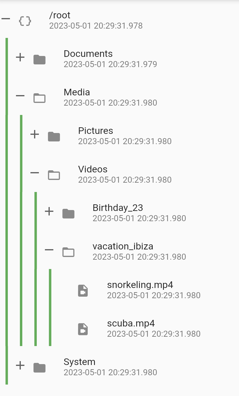
- Infinite levels and child nodes.
- Animations for Node expansion and collapse.
- Customizable indentation and scoping lines
- Plenty of utility methods for adding, inserting, removing and collapsing/expanding nodes.
- Easily traverse the tree laterally or vertically from the root to the leaf and back.
- Tree Diff Util to compute the difference between two trees, and automatically apply the changes in the tree view.
- Listenable changes using ValueNotifier and event Streams.
- RTL Support
You can simply use the provided TreeNode or extend your data object from TreeNode<T>.
Note: If the key is omitted, then a unique key will be automatically assigned to the Node.
Finally, initialize the TreeView by providing it a builder.
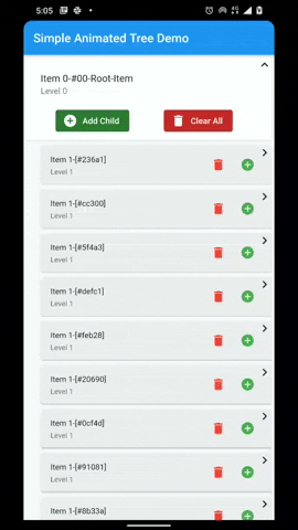
TreeView.simple(
    tree: TreeNode.root(),
    builder: (context, node) {
        // build your node item here
        // return any widget that you need
        return ListTile(
          title: Text("Item ${node.level}-${node.key}"),
          subtitle: Text('Level ${node.level}'),
        );
    }
The level has been removed from the builder starting from version 2.0.0. To get the node level, use the node.level instead.
The usage of TreeView.indexed is exactly the same as a simple TreeView. You only need to replace TreeNode with IndexedTreeNode or extend your YourCustomNode from IndexedTreeNode like this
Finally initialize the widget like this:
TreeView.indexed(
    tree: IndexedTreeNode.root(),
    builder: (context, node) {
        // build your node item here
        // return any widget that you need
        return ListTile(
          title: Text("Item ${node.level}-${node.key}"),
          subtitle: Text('Level ${node.level}'),
        );
    }
Please see this example for a more comprehsive code sample.
To use your custom data type CustomClass with TreeView, wrap your custom class inside the TreeNode like this TreeNode<CustomClass>
TreeView.simpleTyped<CustomClass, TreeNode<CustomClass>>(
    tree: TreeNode<CustomClass>.root(),
    builder: (context, node) {
      // build your node item here
      // return any widget that you need
      return ListTile(
          title: Text("Item ${node.level}-${node.key}"),
          subtitle: Text('Level ${node.data?.foo}'),
    );
  }
)
Please see this example for a more comprehsive custom object code sample.
The API and usage of SliverTreeView is the same as TreeView. You just need to wrap the SliverTreeView
inside a CustomScrollView and provide it a Tree and a builder.
CustomScrollView(
    slivers: [
      SliverTreeView.simple(
        tree: TreeNode.root(),
        builder: (context, node) {
          // build your node item here
          // return any widget that you need
          return ListTile(
            title: Text("Item ${node.level}-${node.key}"),
            subtitle: Text('Level ${node.level}'),
          );
        },
      ),
    ],
  );
Please see this example for a more comprehsive sliver treeview sample.
| Attributes | Description |
|---|---|
| builder | The builder function that is provided to the item builder. It lazily builds the list items. The built widget is passed to the AnimatedList or SliverAnimatedList's itemBuilder. |
| tree | Tree that is used to populate the TreeView. If the tree is updated using any state management tools like setState or Bloc, then the TreeDiffUtil is used to get the diff between the two trees, and apply all the changes from the new tree onto the old tree. |
| scrollController | Provide a scrollController for more granular control over scrolling behavior. |
| expansionIndicatorBuilder | Builds an animated expansion indicator based on the node data. See ExpansionIndicator for available expansion indicators. |
| indentation | The indentation style that is used to draw the indents for each node. Indentation.width will be multiplied by Node-Level before being applied as starting padding to the item widget. See Indentation for available indent styles and decoration. |
| onItemTap | Callback that can be used to handle any action when an item is tapped or clicked. |
| showRootNode | Flag to show the Root Node in the TreeView. |
| expansionBehavior | The ExpansionBehavior provides control over the behavior of the node when it is expanded. See ExpansionBehavior for available behaviors. |
| onTreeReady | Callback to get the TreeViewController when the TreeView is ready |
| padding | The amount of space by which to inset the children. |
| primary (TreeView only) | Whether this is the primary scroll view associated with the parent PrimaryScrollController. |
| physics (TreeView only) | An object that can be used to control the position to which this scroll view is scrolled. |
| shrinkWrap (TreeView only) | Whether the extent of the scroll view in the scrollDirection should be determined by the contents being viewed. |
| animation | Optional param to specify the animation for the item addition and removal |
The ExpansionBehavior provides control over the behavior of the node when it is expanded.
There are five available ExpansionBehaviors to choose from.
**Note: For using an ExpansionBehavior with a SliverTreeView, the same instance of an AutoScrollController
needs to be provided to SliverTreeView and the CustoScrollView.
ExpansionBehavior.none |
ExpansionBehavior.snapToTop |
ExpansionBehavior.scrollToLastChild |
ExpansionBehavior.collapseOthers |
ExpansionBehavior.collapseOthersAndSnapToTop |
|---|---|---|---|---|
| No additional action will be taken on node expansion. | The expanded node will be snapped to the top of the list. This ensures that the expanded node is always visible with maximum number of children. | The list will be scrolled to the last child of the node if it is not already visible on screen. This ensures that the last child is always visible. | Collapse all other nodes, only the current node will remain expanded. This ensures that only one node is expanded at one time. | Collapse all other nodes, only the current node will remain expanded, also snap the node to the top of the list. This ensures that only one node is expanded at one time. |
 |
 |
 |
 |
 |
The expansion indicator animates to change it's state based on the whether the node is collapsed or expanded. There are several built-in expansion indicators.
ChevronIndicator.rightDown |
ChevronIndicator.upDown |
PlusMinusIndicator |
|---|---|---|
 |
 |
 |
noExpansionIndicatorBuilder can be used when no indicator is required.
ExpansionIndicator class can be extended to create a fully customizable expansion indicator.
The indentations are drawn to show the node level and the connections between different nodes. The lineWidth, color and offset of the indentation can be customized with the Indentation.
By default IndentStyle.none is used and indentation lines are not drawn. Only the indentation.width will be used to add padding to the start of the content.
To draw indents change the style to IndentStyle.squareJoint or IndentStyle.roundJoint.
To draw only scoping lines, change the style to IndentStyle.scopingLine.
IndentStyle.squareJoint |
IndentStyle.roundJoint |
IndentStyle.scopingLines |
IndentStyle.none |
|---|---|---|---|
 |
 |
 |
 |
A TreeDiffUtil is used to determine the difference between two trees if the tree is updated using any state management tool like setState or Bloc etc.
For TreeView.simple, which uses a Map internally to store the child nodes, this is a simple difference operation on all the nodes of the tree. Complexity is O(2n), where n is the total number of nodes in the tree.
For TreeView.indexed, which uses a List internally to store the child nodes, it is a little more complex as Myer's algorithm is used to determine the difference in the children of each respective node. Complexity is O(N + D^2), where D is the length of the edit script. For more details see diffutil_dart.
| Method | TreeView | IndexedTreeView | Description |
|---|---|---|---|
isRoot |
✅ | ✅ | Getter to check if the node is a root |
isLeaf |
✅ | ✅ | Getter to check if the node is a Leaf |
root (getter) |
✅ | ✅ | Getter to get the root node. If the current node is not a root, then the getter will traverse up the path to get the root. |
level |
✅ | ✅ | Getter to get the level i.e. how many iterations it will take to get to the root. |
elementAt |
✅ | ✅ | Utility method to get a child any child node at the path. The path contains the keys of the node separated by period . e.g. #grandparent_key.#parent_key.#node |
add |
✅ | ✅ | Add a child to the node |
addAll |
✅ | ✅ | Add a collection of nodes to the node |
remove |
✅ | ✅ | Remove a child from the node |
removeAll |
✅ | ✅ | Remove a collection of nodes from the node |
removeWhere |
✅ | ✅ | Remove children from the node that meet the criterion in the provided test |
delete |
✅ | ✅ | Delete the current node |
clear |
✅ | ✅ | Remove all the child nodes: after this operation the children are empty |
first |
⭕ | ✅ | Get/Set first child in the node |
last |
⭕ | ✅ | Get/Set last child in the node |
insert |
⭕ | ✅ | Insert a child at an index in the node |
insertAll |
⭕ | ✅ | Insert a list of children at an index in the node |
insertAfter |
⭕ | ✅ | Insert a child after the node |
insertBefore |
⭕ | ✅ | Insert a child before the node |
removeAt |
⭕ | ✅ | Remove a child at the index |
firstWhere |
⭕ | ✅ | Get the first child node that matches the criterion in the test. |
lastWhere |
⭕ | ✅ | Get the last child node that matches the criterion in the test. |
indexWhere |
⭕ | ✅ | Get the index of the first child node that matches the criterion in the test. |
The TreeViewController provides utility methods that allow controlling the TreeView programmatically.
| Method | Description |
|---|---|
elementAt |
Get any item at path from the root. The keys of the items to be traversed should be provided in the path |
root |
Root node of the TreeView |
scrollToIndex |
Allows to scroll to any item with index in the list. If you do not have the index of the item, then use the alternate scrollToItem method item instead. |
scrollToItem |
Utility method to scroll to any visible item in the tree. |
toggleExpansion |
Utility method to expand or collapse a tree node. |
expandNode |
Utility method for expanding a tree node. |
collapseNode |
Utility method for collapsing a tree node. |
expandAllChildren |
Utility method for expanding all the children of a node. It can be also be used to recursively expanded all the child nodes until the leaf is reached |
- Add RTL support
- Add support for 2D scrolling using the 2D scrolling API
- Reorder nodes in the hierarchy
- Indentation builder