feat: refresh Hermes WebUI logo#2475
Conversation


 Michaelyklam
force-pushed
the
fix/issue-2467-modern-logo
branch
from
Michaelyklam
force-pushed
the
fix/issue-2467-modern-logo
branch
from
bc91eae to
0a04778
Compare


|
Thanks for this — logo refresh is a major brand-mark change with broad visibility (favicon, PWA install icon, mobile touch icon, titlebar, empty-state). Putting on UX hold for Aron's review before merge. The diff shape is right (single SVG source regenerated to PNG/ICO, no build step, no theme change, 4-test regression coverage), but the bar for any change that touches every browser-tab icon + install icon + titlebar is: ship one stable mark, not two. A few things to confirm in the PR body before UX review:
Once the visual evidence is attached I'll tag @aronprins for UX sign-off. CI is green; no rebase needed. |
 Michaelyklam
force-pushed
the
fix/issue-2467-modern-logo
branch
from
Michaelyklam
force-pushed
the
fix/issue-2467-modern-logo
branch
from
0a04778 to
8588aec
Compare
|
Rebased this on current Verification on the rebased head:
GitHub Actions are now green on the rebased head. |
Michaelyklam
force-pushed
the
fix/issue-2467-modern-logo
branch
from
8588aec to
8babecc
Compare
|
Rebased this again on current Verification on the rebased head:
The PR is mergeable again at |
Michaelyklam
force-pushed
the
fix/issue-2467-modern-logo
branch
2 times, most recently
from
f35413e to
13fa28e
Compare
|
Rebased this on current Verification on the rebased head:
Current head is |
Michaelyklam
force-pushed
the
fix/issue-2467-modern-logo
branch
from
13fa28e to
f623d01
Compare
|
Rebased this PR onto the latest Verification on the rebased head:
GitHub Actions are now green on the new head and the PR is mergeable. |

|
@Michaelyklam I don't think the new logo looks quite right... can you take a look |
Michaelyklam
force-pushed
the
fix/issue-2467-modern-logo
branch
from
f623d01 to
a4f03f5
Compare
|
Rebased this again onto current Verification on the rebased head:
On the logo direction: I have not changed the mark yet because the current feedback is still broad. If the concern is mainly the shape, line weight, color/contrast, favicon legibility, or in-app sizing, could you point to the part that feels off? I can tune that in a focused follow-up. |
Michaelyklam
force-pushed
the
fix/issue-2467-modern-logo
branch
from
a4f03f5 to
0520331
Compare
|
Rebased this onto current Verification on the rebased head:
Current head is |

|
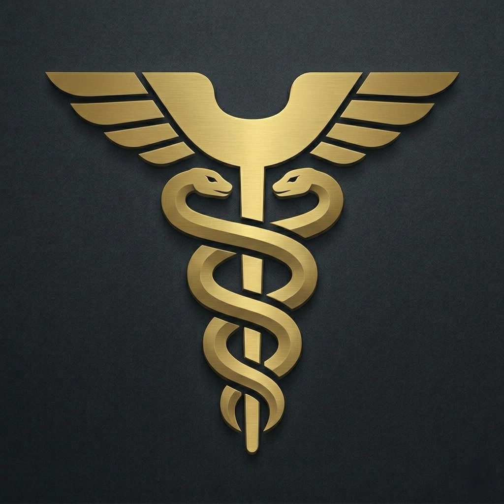
Hey @nesquena, thanks for the honest feedback — the previous caduceus mark wasn't hitting the mark, so we went back to the drawing board. Here are two refined logo directions we've been working on, both keeping the modern geometric caduceus approach but with adjusted proportions, line weight, and detail level: Variación 1 — Perfil más esbelto, serpientes estilizadas
A cleaner, more minimalist take. The caduceus keeps the classic dual-snake + winged structure but with thinner, more refined serpent curves and a taller, sleeker staff proportion. The wings are angular and segmented, giving it a tech-forward feel while staying legible at small sizes. Variación 2 — Más presencia, serpientes envolventes más marcadas
A bolder expression of the same concept. The snakes wrap more tightly around a slightly wider staff, with more pronounced wing segments. The metallic gold depth is stronger here, giving it more visual weight for use as a primary app icon or PWA install icon. Both retain the Hermes gold palette, scale cleanly to favicon size, and follow the existing no-build-step constraint (single SVG source → PNG/ICO regeneration). Would love to hear which direction resonates better — or if there's a specific aspect (line weight, wing shape, snake curvature) you'd like us to push further on. |


4 participants


Thinking Path
What Changed
Why It Matters
Verification
python -m pytest tests/test_issue2467_logo_refresh.py tests/test_pwa_manifest_sw.py::TestBaseHrefOrdering::test_base_href_script_before_favicon_links tests/test_session_static_assets.py::test_session_static_favicon_512_returns_png -q— 4 passedenv -u HERMES_CONFIG_PATH -u HERMES_WEBUI_HOST python -m pytest tests/ -q— 5861 passed, 6 skipped, 3 xpassed, 8 subtests passednode --check static/boot.jsgit diff --checkUI Media
Before/after logo comparison:
Individual assets:
Risks / Follow-ups
Model Used
AI-assisted change with repository inspection, targeted editing, generated asset verification, and shell-based test verification.
Closes #2467