Home
Author: Max S. Haberman
In SurveyCTO, you can use field lists to show multiple fields on the same page, and even create a table of select_one or select_multiple fields. This field pug-in expands upon the field list concept with these two improvements:
- The header row which labels the grid of radio buttons for choices persistently remains at the top of the table, like when you freeze the top row of spreadsheet so it can be seen even when you scroll down.
- A field time duration can be specified so the field must be completed within a certain time limit
| None selected | All blocked | select_multiple | Not timed |
|---|---|---|---|
 |
 |
 |
 |
| Milliseconds | No change | Blocked checks | No blocking |
|---|---|---|---|
 |
 |
 |
 |
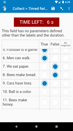
This field plug-in is useful for many types of timed assessment. For example, what if you are running an EGRA test, and you would like respondents to complete an illogical comparison test (give an English sentence, and ask if it is logical or illogical)? Take a look at the first screenshot above. There are a series of statements in English, and the respondent must determine if each statement is true or false within a time limit. With this field plug-in, the respondent can easily scroll through each row and select the answers, while still being able to see how much time they have left. All the while, the label header row is persistent. For an example, check out this video.
This wiki goes into full detail on how the timed-field-list field plug-in works and how to use it. However, feel free to skip the parts that are not relevant to your situation. The most important sections are sections 1.1 Main sample form, 3. Choice list, 4.1 Required parameter, 4.2 Important parameters, 5.1.1 Retrieving the raw data, 5.3 Selected choices, and possibly 7. Pairing with the button-to-advance field plug-in. Also be sure to check out the sample form, which demonstrates how to use the field plug-in, as well as many of its parameters.

This plug-in is currently under beta. If you you find a problem with the field plug-in, please email [email protected].
This article is accompanied by two sample forms, but the first is more important. For assistance deploying these forms, check out our support article on deploying form definitions and server datasets.
This is the main sample form, which demonstrates most of the parameters and tools described in this field plug-in.
In addition to using the timed-field-list field plug-in, this sample form also uses the button-to-advance field plug-in, which you can download from section 1.3 below. Details about that field plug-in are discussed in section 7. If you do not want to use the additional field plug-in, you can remove the "startbutton" field from the form before deploying it.
If you prefer to have multiple pages of timed fields that share the same timer instead of scrolling down to view the other rows, check out this sample form. For details on how it works, check out section 6.1 Multi-page setup below.
In addition to using the timed-field-list field plug-in, this sample form also uses the button-to-advance field plug-in, which you can download from section 1.3 below. If you do not want to use the additional field plug-in, you can remove the "startbutton" field from the form before deploying it.
button-to-advance: Documentation | Plug-in file
The timed-field-list field plug-in supports the select_one field and select_multiple field types. Just like normal fields, the field type will determine the type of buttons that will be used.
Field plug-ins are defined in the appearance of the field. Like all field plug-ins, add "custom-" to the beginning of the field plug-in name, add parentheses to the end, and put that into the appearance of the field you would like to make into a field list (unlike normal field lists, this will just be one field, not several). Then, within the parentheses, define your parameters. Here is an example appearance you could use:
custom-timed-field-list(labels=${labels}, duration=20)
To learn more about the basics of field plug-ins, check out our guide to field plug-ins.
Each choice in your choice list will become a column, and the label of that choice will be the column header.
The exception is if one of your choice values matches the value of the pass parameter. If this is the case, then that column will not appear in the table.

For example, this field has this choice list:
| list_name | value | label |
|---|---|---|
| truefalse | 1 | True |
| truefalse | 0 | False |
| truefalse | -1 | No response |
| truefalse | -99 | Pass |
In the field pictured above, the pass parameter is not defined, so the "pass" value is -99, so there is no "Pass" column. However, if no choice is selected in that row, then that row will be given a value of -99.
The advantage of adding this as a choice is that you can use the choice-label() function to retrieve the choice label. For an example, check out the field "long_list_choice_label" in the sample form, which is then later displayed in the note field "long_list_disp".
The only required parameter is the labels parameter. Here, you will define the row labels in a pipe-separated (|) list. Row labels will be shown in the left-most column. For example, if the first row should have a label of "Birds lay eggs.", and the second row should have a label of "Chickens have pencils.", the "labels" parameter should have this value:
'Birds lay eggs.|Chickens have pencils.'
It may also be easier to store the list of labels in a calculate field. That way, if other parameters are being used, they are easier to see in the appearance of the field. For an example, check out the "labels" field of the sample form.
If you are building your form in Excel, keep in mind that Excel uses the single-quote ' to mean the data is a string and not a formula, so it will drop it in the view. If your cell's value really should start with a single quote, use two of them in a row; that way, the first one will be used to show that the data is a string, and the other one will be a part of the actual data.
|
duration: How much time the timer starts with, in seconds. Even if the unit (see below) will be something other than seconds, this parameter should still be given in number of seconds. You can even do partial seconds, like 2.5. If this parameter is not defined, then the field list will not be timed, and the timer will be hidden.
If duration is not defined, then the field list will not be timed, and the timer will be hidden.
Many parameters change behavior when the duration parameter is not defined, and retrieving the data is also different. See below for more details.
There are a lot of other optional parameters you can use to customize the field plug-in's behavior and appearance, but chances are you will not need most of them. Look through each one, and decide if they are needed to meet your objectives. If these parameters are not defined, then their default values will be used. For most of these parameters, 1 means it is turned on, and 0 means it is turned off.
These parameters affect how the field plug-in will look.
unit: The unit the time will be displayed in. This can be 's' for seconds, 'ds' for deciseconds (tenths of a second), 'cs' for centiseconds (hundredths of a second), or 'ms' for milliseconds (thousands of a second). The time given in "duration" will be converted to that unit for the display. For example, if the duration is 20 seconds, and the unit is milliseconds (ms), then it will be displayed as 20000 ms.
Default: 's'
| unit | Full name | Unit in 1 second |
|---|---|---|
| s | Second | 1 |
| ds | Decisecond | 10 |
| cs | Centisecond | 100 |
| ms | Millisecond | 1,000 |
Use the unit in single quotes for the parameters, such as unit='ms'.
This parameter does nothing if the duration parameter is not defined.
pass: The value given to the row if no choice is selected. If one of your choices has a value of the pass parameter, then that choice will not appear as a column in the table. Do not use a choice value that uses the pipe |, since this is used to store the choices selected (see 4. Retrieving the selected choices below).
Default: -99
numberrows: Whether the rows will be numbered. By default, each row is assigned a number to be displayed to the left of the row's label. To turn this off, give this parameter a value of 0.
Default: 1
numberstart: What number the row numbering starts with. For example, if this field has a value of 8, then the first row will be numbered 8, the second row will be numbered 9, and so on. This is great for multi-page field lists. For an example, check out the multi-page timed field list.xlsx sample form. Default: 1
disp: Whether or not to display the timer in the field. If this parameter is equal to 0, then the timer will not be displayed. Otherwise, if the duration parameter is defined, the default value of this parameter will be 1, and the timer will be displayed.
Default (if duration is specified): 1
Default (if duration is not specified): 0
header: This will be the header for the row label column. In other words, it will be in the top-left-most cell of the table. You can even use HTML tags if you'd like.
Default: (blank)
| Usually, in a field list grid, the top-left cell contains the field label. In this field plug-in, the label goes above the table, but below the timer. |
These parameters affect how the field plug-in will behave under certain circumstances, such as when certain rows will be blocked, and when it may auto-advance.
advance: Whether the field should auto-advance after time runs out. By default (if the parameter is not specified), when time runs out, then the respondent will stay on the same field until they decide to move on. If this parameter has a value of 1, then when time runs out, the field will auto-advance to the next field. This can be helpful for faster-paced tests. Of course, make sure your respondents still get breaks!
If the field list is not timed, and this parameter has a value of 1, it will not auto-advance while the respondent remains on the field. However, they will be auto-advanced if they leave the field and then return when all of the rows have already been completed.
Default: 0
Note: In web forms, make sure the respondent does not quickly click the "back" button multiple times in a row (four or more times), or it may erase the data for that field, allow them to complete it again, and cause other issues in the form.
block: Whether the respondent can change their selections after time runs out. By default, all input will be blocked after time runs out. If this parameter is equal to 0, then an enumerator/respondent can change their selections after time runs out.
If the field list is not timed, then this field will have a value of 0 by default, meaning it will not block answers. However, if the field is not timed, and the block parameter has a value of 1, then all values will be blocked if the respondent completes each row, leaves the field, and then returns.
Default: 1
nochange: Whether the respondent can change their answer in a row after selecting an answer. Normally, input will not be blocked until time runs out. If this parameter is equal to 1, then that individual row will be blocked as soon as a choice is selected. Not recommended for select_multiple fields.
Default: 0
required: Whether every question row in the table needs to be completed. If this parameter has a value of 1, then the rows will not be disabled (see the block parameter above), and the field will not auto-advance (see the advance parameter above) until all rows have a choice selected. Once each row has a value, then the block and advance parameters will take action again (if applicable). However, this parameter does not override the nochange parameter.
Default: 0
If nochange has a value of 1, then completed rows will be blocked, but incomplete rows will not be blocked until they are answered.
This parameter does nothing if the duration parameter is not defined.
endearly: Whether the respondent can leave the field when there is still time remaining. By default, the respondent can move on to the next field as long as each row has been answered (if they try to leave the field when there are some unanswered rows, they will get a warning that the field is required, and stay where they are). If this parameter has a value of 0, then the respondent cannot leave the field until time has run out, even if all rows have already been completed.
Default: 1
If nochange has a value of 1, then "endearly" will always have a value of 1. Otherwise, all fields would be blocked, and the respondent will be waiting around for the time to run out, even though none of the rows can be changed.
This parameter does nothing if the duration parameter is not defined.
These is recommended for advanced users only.
adjust: This is how many pixels taller or shorter the display should be. On most devices, the timer should always be on top and unmoved, and the enumerator/respondent can scroll through the rows of the table. If you find that some devices cannot scroll through the table, then the table is too long, and it should be made shorter. If there is too much blank space below the table, then if you'd like, the table can be made longer. Give this parameter a positive value if the table should be longer, and a negative value if it should be shorter.
Default: 0
Warning: Use adjust with caution. You'll have good results if all collection devices are the same make and model. However, if your screen sizes are quite different, with the wrong adjust value, you may not be able to scroll through the field list.
immediate: If this parameter has a value of 1, then a value is immediately set for the field. Even if the field is required but not complete, the respondent can leave the field. This is unlikely to be needed, since choices selected are stored in the metadata.
Default: 0
Here is how you can retrieve the data collected in the table within your form. For an example, check out rows 17 ("long_list_data") through 28 ("long_list_disp") of the sample form.
For an example, check out row 17 of the sample form, "long_list_data".
A key part of this field plug-in is that the choices selected are stored in the metadata, not the field value. To retrieve the choices selected, use the plug-in-metadata() function.
Within that data, each section of data is separated by a pipe |, and within those sections, parts are divided by spaces.
Here is an example raw data from a select_one field list:
0 1577901432542|1|0|1|-1|-99|0
And here is an example raw data from a select_multiple field list:
0 1577901432542|0 1|1 2 3|1|2|0 3|0 1 2 3|1 3
Here, the first section is 0 1577901432542, the second section is 0 1, and so on. The first section stores time information (the time remaining in the field in milliseconds, and the Unix time of when the respondent was last at the field), and the other sections store the choices selected.
| In the above example raw data, the 1577901432542 is the Unix time the field was last opened. This is used internally by the field plug-in, and you will probably not need it in your data analysis. |
To retrieve data from that raw data, use the item-at() and/or selected-at() functions. See the following sections to learn how to use those functions with this data.
For an example, check out row 18 of the sample form, "long_list_time_left". This is only applicable if the duration parameter is defined.
For some form setups, you will want to know how much time was left on the timer when the respondent left the field. This is the first number in the first section of the raw data. Because that time is separated from the rest of the data by a space, you can use the selected-at() function to retrieve that value, like this:
selected-at(${choice_grid}, 0)
This works because the time remaining is the first value stored, and it is separated from the rest of the data by a space.
For an example, check out rows 19 through 27 of the sample form, "num_labels" through "ans_disp".
You can also use the item-at() function to retrieve the choices selected in each row. For example, you can use this expression to retrieve the choices selected in the first row of the table:
item-at('|', ${choice_grid}, 1)
The index 1 retrieves the first row, 2 retrieves the second row, and so on. However, if this is not a timed field list, meaning the duration parameter is not defined, then index 0 retrieves the first row, index 1 retrieves the second, and so on.
Once you have the row data, if it is a select_multiple field, you can use either the item-at() function or the selected-at() function to retrieve each selected choice (this is unnecessary in select_one fields, since there will only be one choice in each row). For example, if the field "row1" stores the choices selected in row 1, you can use this expression to retrieve the first choice selected in that row:
selected-at(${row1}, 0)
You can also use a repeat group to loop through each row and each choice. For an example, check out the sample form, where the repeat group "long_list_ans" is used to cycle through each row, and disp
Here are other features of the field plug-in that have not already been mentioned, as well as details on some features that have already been mentioned.
- Font headers will shrink to fit in the column so they are not cut off. You can see this in the "No response" header in the sample form.
- If the respondent leaves the field, the timer will continue. For example, if there are 15 seconds left on the time, and the respondent goes to another field for 5 seconds, when they return, there will be 10 seconds remaining.
- The respondent cannot move to the next field until all questions in the field list have been answered, or time runs out. This can be changed with the "required" and "endearly" parameters.
This section is accompanied by the sample form in section 1.2 above.
Sometimes, it is better to have field lists on multiple pages instead of scrolling down to see all of the choices. To make sure all pages share the same timer that counts down at the same time, you will need to create a series of fields that keep track of the time passed so far.
If you would like to use this method, you can copy the fields in the sample form into your own form. You can add new sections by copying the rows in section 3 (rows 44-54), pasting them below that section, and changing the 3's to new numbers. As you add or remove pages, add an additional "list#" field right below row 17, and in the calculation for the field "all_ans" (currently on row 61), add an additional , '|', ${all_ans#} right before the last end parenthesis. You can then change the "list#" fields and choice lists to reflect your own needs.
To change the starting time, simply change the calculation of "time_start" on row 19 from 20 to another number. This will be the start time in seconds
These are the programming steps used, along with the field plug-in, to achieve the multi-page setup. If you would like to review these steps, be sure to reference the sample form.
- The field "dec_start_time" tracks when the timer started. Then, for section 2, the field "current_dec2" checks the time the respondent made it to that field.
- The field "seconds_past2" compares "current_dec2" and "dec_start_time" to determine how much time has passed in seconds (the
* 86400part converts the fraction of a day passed to seconds), and the field "timeleft2" subtracts that from the initial start time "time_start". - The field "timeleft2" stores the amount of time that is left, and that is used for the value of the
durationparameter in the actual field plug-in in the field "page". - This same process is used for "page2".
- The first field, "page1", does not need it, because it is the first field, so it starts with the beginning "time_start" value.
The choices selected for the field "page1" are retrieved on rows 23-29 ("field_data1" to "all_ans1"). First, the data is retrieved using the plug-in-metadata() function. This is done using a calculate_here field so that it re-calculates each time. Because the actual value of the field "page1" does not actually change, it needs a calculate_here so if the respondent goes back-and-forth, the field re-calculates and updates. Technically, since the calculate fields will also re-calculate when the form is saved-and-closed, it only needs to be a calculate_here field when you want to display the choices selected in the form, and the respondent is allowed to swipe back-and-forth between the pages; otherwise, it can be a normal calculate field.
Once you have the raw field plug-in metadata, the form needs to drop the first, unnecessary "time" part of the data.
- The form needs the number of rows the field had, so in the field "num_ans1" on row 24, it first counts the number of pieces of data separated by a pipe
|, and subtracts 1 (because the first piece of data is the time data). - The number of rows is used as the repeat_count of the repeat group "get_ans1".
- In that repeat group, the field "data_ans1" uses the item-at() function to iterate through each piece of data, skipping the first one.
- Finally, that data is re-joined using the join() function in the field "all_ans1". That way, there is a pipe-separated list of all choices selected.
All of that partial data is later joined with a simple concat() expression in the field "all_ans".
Here are other details about how it works:
- All pages except for the last page are not required. This is so the respondent can swipe forward even if not all rows on that page have been completed. That way, if they get stuck, they can move on, and maybe return later with the time they have left.
- The last page is required so the respondent does not accidentally leave the field list pages while the timer is still running.
- The last page has an
endearlyvalue of0. That way, if all rows on that page are completed, they still cannot move forward until time runs out, which can encourage them to swipe back and check their work, or complete rows they had previously skipped.
It is a good idea to add a text field right before the timed-field-list that uses the button-to-advance field plug-in. With that field plug-in, there will be a button the respondent can click/tap to start and move to the next field. Also, if they attempt to go back to that field, they will be automatically moved forward, returning to the field they were on. This is especially helpful on mobile, since if the respondent's finger slips while completing the timed field list and they accidentally swipe back, they will be immediately returned, and able to continue. For an example, check out this video.