-
Notifications
You must be signed in to change notification settings - Fork 14
Carlos Estrada exercise 1 #11
New issue
Have a question about this project? Sign up for a free GitHub account to open an issue and contact its maintainers and the community.
By clicking “Sign up for GitHub”, you agree to our terms of service and privacy statement. We’ll occasionally send you account related emails.
Already on GitHub? Sign in to your account
Open
Loptt
wants to merge
5
commits into
AlexHenkel:master
Choose a base branch
from
Loptt:CarlosEstrada-Exercise1
base: master
Could not load branches
Branch not found: {{ refName }}
Loading
Could not load tags
Nothing to show
Loading
Are you sure you want to change the base?
Some commits from the old base branch may be removed from the timeline,
and old review comments may become outdated.
Open
Changes from all commits
Commits
Show all changes
5 commits
Select commit
Hold shift + click to select a range
File filter
Filter by extension
Conversations
Failed to load comments.
Loading
Jump to
Jump to file
Failed to load files.
Loading
Diff view
Diff view
There are no files selected for viewing
This file contains hidden or bidirectional Unicode text that may be interpreted or compiled differently than what appears below. To review, open the file in an editor that reveals hidden Unicode characters.
Learn more about bidirectional Unicode characters
| Original file line number | Diff line number | Diff line change |
|---|---|---|
| @@ -0,0 +1,132 @@ | ||
| body { | ||
| font-family: Montserrat; | ||
| } | ||
|
|
||
| .header { | ||
| background-color: #EE646C; | ||
| background-image: url("../img/logo2.png"); | ||
| background-size: contain; | ||
| background-repeat: no-repeat; | ||
| background-position: center; | ||
| display: table-cell; | ||
| vertical-align: middle; | ||
| text-align: center; | ||
| margin-bottom: 50px; | ||
| height: 200px; | ||
| } | ||
|
|
||
| .main-content { | ||
| padding-bottom: 50px; | ||
| } | ||
|
|
||
| .footer { | ||
| background-color: #EE646C; | ||
| height: 250px; | ||
| text-align: center; | ||
| color: #f2f2f2; | ||
| } | ||
|
|
||
| .social-media-title { | ||
| margin-bottom: 15px; | ||
| } | ||
|
|
||
| .icon { | ||
| width: 150px; | ||
| height: 150px; | ||
| margin-left: auto; | ||
| margin-right: auto; | ||
| display: block; | ||
| margin-bottom: 50px; | ||
| } | ||
|
|
||
| .icon-no-center{ | ||
| width: 150px; | ||
| height: 150px; | ||
| margin-bottom: 40px; | ||
| } | ||
|
|
||
| .location-list { | ||
| margin-bottom: 40px; | ||
| } | ||
|
|
||
| .classes-table { | ||
| margin-bottom: 40px; | ||
| } | ||
|
|
||
| .gallery-image { | ||
| object-fit: cover; | ||
| width: 165px; | ||
| height: 165px; | ||
| margin-bottom: 30px; | ||
| } | ||
|
|
||
| h2 { | ||
| color: #EE646C; | ||
| padding-bottom: 15px; | ||
| margin-top: 0px; | ||
| } | ||
|
|
||
| h4 { | ||
| color: #EE646C; | ||
| padding-bottom: 15px; | ||
| padding-top: 15px; | ||
| font-weight: bold; | ||
| } | ||
|
|
||
| p { | ||
| line-height: 35px; | ||
| padding-top: 15px; | ||
| padding-bottom: 15px; | ||
| font-size: 16px; | ||
| color: #777777; | ||
| } | ||
|
|
||
| strong { | ||
| color: #EE646C; | ||
| } | ||
|
|
||
| li { | ||
| color: #777777; | ||
| font-size: 16px; | ||
| padding-top: 10px; | ||
| } | ||
|
|
||
| tr { | ||
| color: #777777; | ||
| font-size: 16px; | ||
| padding-top: 10px; | ||
| } | ||
|
|
||
| td { | ||
| color: #777777; | ||
| font-size: 16px; | ||
| padding-top: 10px; | ||
| } | ||
|
|
||
| label { | ||
| color: #777777; | ||
| font-size: 16px; | ||
| padding-top: 10px; | ||
| } | ||
|
|
||
| legend { | ||
| color: #777777; | ||
| font-size: 16px; | ||
| padding-top: 10px; | ||
| font-weight: bold; | ||
| } | ||
|
|
||
| img.social-media { | ||
| margin-bottom: 15px; | ||
| width: 50px; | ||
| height: 50px; | ||
| } | ||
|
|
||
| a { | ||
| text-decoration: none; | ||
| color: #777777; | ||
| } | ||
|
|
||
| a:hover { | ||
| color: #EE646C; | ||
| } |

Loading
Sorry, something went wrong. Reload?
Sorry, we cannot display this file.
Sorry, this file is invalid so it cannot be displayed.

Loading
Sorry, something went wrong. Reload?
Sorry, we cannot display this file.
Sorry, this file is invalid so it cannot be displayed.

Loading
Sorry, something went wrong. Reload?
Sorry, we cannot display this file.
Sorry, this file is invalid so it cannot be displayed.
This file contains hidden or bidirectional Unicode text that may be interpreted or compiled differently than what appears below. To review, open the file in an editor that reveals hidden Unicode characters.
Learn more about bidirectional Unicode characters
| Original file line number | Diff line number | Diff line change |
|---|---|---|
| @@ -0,0 +1,191 @@ | ||
| <!DOCTYPE html> | ||
| <html lang="en"> | ||
| <head> | ||
| <meta charset="utf-8"> | ||
| <meta name="viewport" content="width=device-width, initial-scale=1"> | ||
|
|
||
| <link rel="stylesheet" href="https://maxcdn.bootstrapcdn.com/bootstrap/3.3.7/css/bootstrap.min.css"> | ||
| <link rel="stylesheet" type="text/css" href="css/styles.css"> | ||
| <link href="https://fonts.googleapis.com/css?family=Montserrat:400,400i,700" rel="stylesheet"> | ||
|
|
||
| <script src="https://ajax.googleapis.com/ajax/libs/jquery/3.3.1/jquery.min.js"></script> | ||
| <script src="https://maxcdn.bootstrapcdn.com/bootstrap/3.3.7/js/bootstrap.min.js"></script> | ||
|
|
||
| </head> | ||
| <body> | ||
| <div class="container-fluid"> | ||
| <div class="row"> | ||
| <div class="col-xs-12 header"> | ||
| </div> | ||
| </div> | ||
| </div> | ||
| <div class="container main-content"> | ||
| <div class="row"> | ||
| <div class="col-sm-4"> | ||
| <img class="icon" src="img/code.png"> | ||
| </div> | ||
| <div class="col-sm-8"> | ||
| <h2>About</h2> | ||
| <p>It can be intimidating for women to lear and ask questions when they are in an | ||
| <strong>extreme minority</strong>. While open and welcoming, today's budding developer community is | ||
| up to <strong>91% male</strong>. If we can empower more females with the confidence in their | ||
| technological capabilities <i>we can begin to change this landscape</i>.</p> | ||
| </div> | ||
| </div> | ||
| <div class="row"> | ||
| <div class="col-sm-12"> | ||
| <h2>Our Locations</h2> | ||
| </div> | ||
| </div> | ||
| <div class="row"> | ||
| <div class="col-sm-4"> | ||
| <h4>USA</h4> | ||
| <ul class="location-list"> | ||
| <li><a href="#">Columbus</a></li> | ||
| <li><a href="#">New York</a></li> | ||
| <li><a href="#">Austin</a></li> | ||
| <li><a href="#">Philly</a></li> | ||
| </ul> | ||
| </div> | ||
| <div class="col-sm-4"> | ||
| <h4>World</h4> | ||
| <ul class="location-list"> | ||
| <li><a href="#">Ottawa</a></li> | ||
| <li><a href="#">Sydney</a></li> | ||
| </ul> | ||
| </div> | ||
| <div class="col-sm-4"> | ||
| <img class="icon" src="img/world.png"> | ||
| </div> | ||
| </div> | ||
| <div class="row"> | ||
| <div class="col-sm-12"> | ||
| <h2>Upcoming Classes</h2> | ||
| <table class="table table-hover classes-table"> | ||
| <thead> | ||
| <th>Location</th> | ||
| <th>Topic</th> | ||
| </thead> | ||
| <tbody> | ||
| <tr> | ||
| <td>New York</td> | ||
| <td>JavaScript & jQuery</td> | ||
| </tr> | ||
| <tr> | ||
| <td>San Francisco</td> | ||
| <td>HTML & CSS</td> | ||
| </tr> | ||
| </tbody> | ||
| </table> | ||
| </div> | ||
| </div> | ||
| <div class="row"> | ||
| <div class="col-sm-12"> | ||
| <h2>Gallery</h2> | ||
| </div> | ||
| <div class="col-lg-3 col-md-4 col-sm-6 col-xs-12"> | ||
| <img class="img-rounded gallery-image" src="https://www.canadalearningcode.ca/wp-content/uploads/2016/08/teet.jpg"> | ||
| </div> | ||
| <div class="col-lg-3 col-md-4 col-sm-6 col-xs-12"> | ||
| <img class="img-rounded gallery-image" src="https://static1.squarespace.com/static/5524448ee4b0d6f6b83ab9e2/t/558c4217e4b0d85396656c60/1435255549709/?format=1000w"> | ||
| </div> | ||
| <div class="col-lg-3 col-md-4 col-sm-6 col-xs-12"> | ||
| <img class="img-rounded gallery-image" src="https://www.telegraph.co.uk/content/dam/technology/Spark/Makers-academy/a-career-in-coding.jpg?imwidth=1240"> | ||
| </div> | ||
| <div class="col-lg-3 col-md-4 col-sm-6 col-xs-12"> | ||
| <img class="img-rounded gallery-image" src="https://cdn0.tnwcdn.com/wp-content/blogs.dir/1/files/2015/06/coding-1200x631.jpg"> | ||
| </div> | ||
| </div> | ||
| <div class="row"> | ||
| <div class="col-lg-3 col-md-4 col-sm-6 col-xs-12"> | ||
| <img class="img-rounded gallery-image" src="https://www.canadalearningcode.ca/wp-content/uploads/2016/08/teet.jpg"> | ||
| </div> | ||
| <div class="col-lg-3 col-md-4 col-sm-6 col-xs-12"> | ||
| <img class="img-rounded gallery-image" src="https://static1.squarespace.com/static/5524448ee4b0d6f6b83ab9e2/t/558c4217e4b0d85396656c60/1435255549709/?format=1000w"> | ||
| </div> | ||
| <div class="col-lg-3 col-md-4 col-sm-6 col-xs-12"> | ||
| <img class="img-rounded gallery-image" src="https://www.telegraph.co.uk/content/dam/technology/Spark/Makers-academy/a-career-in-coding.jpg?imwidth=1240"> | ||
| </div> | ||
| <div class="col-lg-3 col-md-4 col-sm-6 col-xs-12"> | ||
| <img class="img-rounded gallery-image" src="https://cdn0.tnwcdn.com/wp-content/blogs.dir/1/files/2015/06/coding-1200x631.jpg"> | ||
| </div> | ||
| </div> | ||
| <div class="row"> | ||
| <div class="col-lg-3 col-md-4 col-sm-6 col-xs-12"> | ||
| <img class="img-rounded gallery-image" src="https://www.canadalearningcode.ca/wp-content/uploads/2016/08/teet.jpg"> | ||
| </div> | ||
| <div class="col-lg-3 col-md-4 col-sm-6 col-xs-12"> | ||
| <img class="img-rounded gallery-image" src="https://static1.squarespace.com/static/5524448ee4b0d6f6b83ab9e2/t/558c4217e4b0d85396656c60/1435255549709/?format=1000w"> | ||
| </div> | ||
| <div class="col-lg-3 col-md-4 col-sm-6 col-xs-12"> | ||
| <img class="img-rounded gallery-image" src="https://www.telegraph.co.uk/content/dam/technology/Spark/Makers-academy/a-career-in-coding.jpg?imwidth=1240"> | ||
| </div> | ||
| <div class="col-lg-3 col-md-4 col-sm-6 col-xs-12"> | ||
| <img class="img-rounded gallery-image" src="https://cdn0.tnwcdn.com/wp-content/blogs.dir/1/files/2015/06/coding-1200x631.jpg"> | ||
| </div> | ||
| </div> | ||
| <div class="row"> | ||
| <div class="col-sm-12"> | ||
| <h2>Sign Up!</h2> | ||
| <form action="#"> | ||
| <div class="form-group"> | ||
| <label for="name">Name:</label> | ||
| <input type="name" class="form-control"> | ||
| </div> | ||
| <div class="form-group"> | ||
| <label for="email">Email:</label> | ||
| <input type="email" class="form-control"> | ||
| </div> | ||
| <div class="form-group"> | ||
| <label for="select1">Location</label> | ||
| <select class="form-control"> | ||
| <option>New York</option> | ||
| <option>San Francisco</option> | ||
| </select> | ||
| </div> | ||
| <fieldset class="form-group"> | ||
| <legend>Gender:</legend> | ||
| <div class="form-check form-check-inline"> | ||
| <label class="radio-inline"> | ||
| <input type="radio" class="form-check-input"> | ||
| Female | ||
| </label> | ||
| </div> | ||
| <div class="form-check form-check-inline"> | ||
| <label class="radio-inline"> | ||
| <input type="radio" class="form-check-input"> | ||
| Male | ||
| </label> | ||
| </div> | ||
| </fieldset> | ||
| <div class="form-group"> | ||
| <label for="experience">Experience:</label> | ||
| <textarea class="form-control" rows="5"></textarea> | ||
| </div> | ||
| <button type="submit" class="btn btn-default">Sign Up</button> | ||
| </form> | ||
| </div> | ||
| </div> | ||
| </div> | ||
| <div class="footer"> | ||
| <div class="container"> | ||
| <div class="row"> | ||
| <div class="col-sm-12 social-media-title"> | ||
| <h3>Social Media</h3> | ||
| </div> | ||
| </div> | ||
| <div class="row"> | ||
| <div class="col-sm-4"> | ||
| <a href="#"><img class="social-media" src="https://cdn1.iconfinder.com/data/icons/logotypes/32/square-twitter-512.png"></a> | ||
| </div> | ||
| <div class="col-sm-4"> | ||
| <a href="#"><img class="social-media" src="https://cdn1.iconfinder.com/data/icons/logotypes/32/square-facebook-512.png"></a> | ||
| </div> | ||
| <div class="col-sm-4"> | ||
| <a href="#"><img class="social-media" src="https://cdn0.iconfinder.com/data/icons/shift-logotypes/32/Flickr-512.png"></a> | ||
| </div> | ||
| </div> | ||
| </div> | ||
| </div> | ||
| </body> | ||
| </html> | ||
Empty file.
Add this suggestion to a batch that can be applied as a single commit.
This suggestion is invalid because no changes were made to the code.
Suggestions cannot be applied while the pull request is closed.
Suggestions cannot be applied while viewing a subset of changes.
Only one suggestion per line can be applied in a batch.
Add this suggestion to a batch that can be applied as a single commit.
Applying suggestions on deleted lines is not supported.
You must change the existing code in this line in order to create a valid suggestion.
Outdated suggestions cannot be applied.
This suggestion has been applied or marked resolved.
Suggestions cannot be applied from pending reviews.
Suggestions cannot be applied on multi-line comments.
Suggestions cannot be applied while the pull request is queued to merge.
Suggestion cannot be applied right now. Please check back later.
There was a problem hiding this comment.
Choose a reason for hiding this comment
The reason will be displayed to describe this comment to others. Learn more.
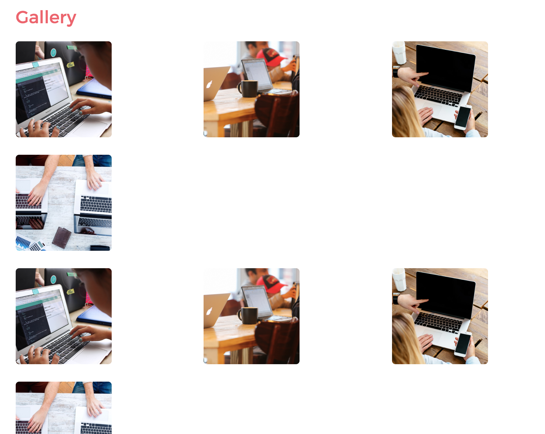
When you have multiple items as columns that belong to the same section (like here, where each column is a photo of the gallery) just use 1
<div class="row">to contain all those items, unless you have a good reason to not do so.Look what happens now at my resolution. This will be fixed if you put all the photo columns in the same row